- 1 |
- Designer: CRAFTR AAIM
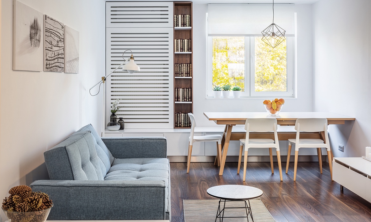
This compact 1 bedroom apartment feels light, airy, and open with its use of white walls and light furnishings. The table is positioned along the window with a pendant light above to offer plenty of light into the space.
- 2 |
- Visualizer: Svoya Studio
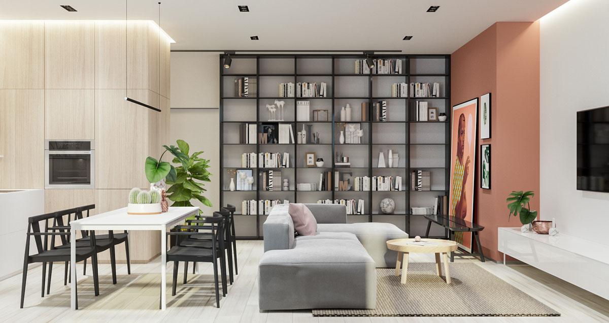
In this visualization of a combination living and dining room, division is created in the space not by using walls or dividers, but by drawing the eye toward the large floor to ceiling bookshelves that run alongside the “living area” of the open floor plan. It’s a clever use of space and adds storage.
- 3 |
- Visualizer: 365 design
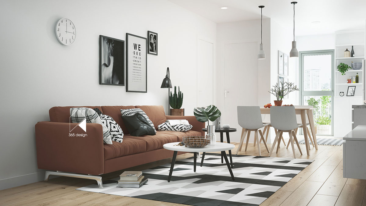
In this chic, modern living room with an open view to a dining area, we see the use of a black and white accents to create visual interest without making the space feel cluttered.
- 4 |
- Visualizer: Oliver Wende
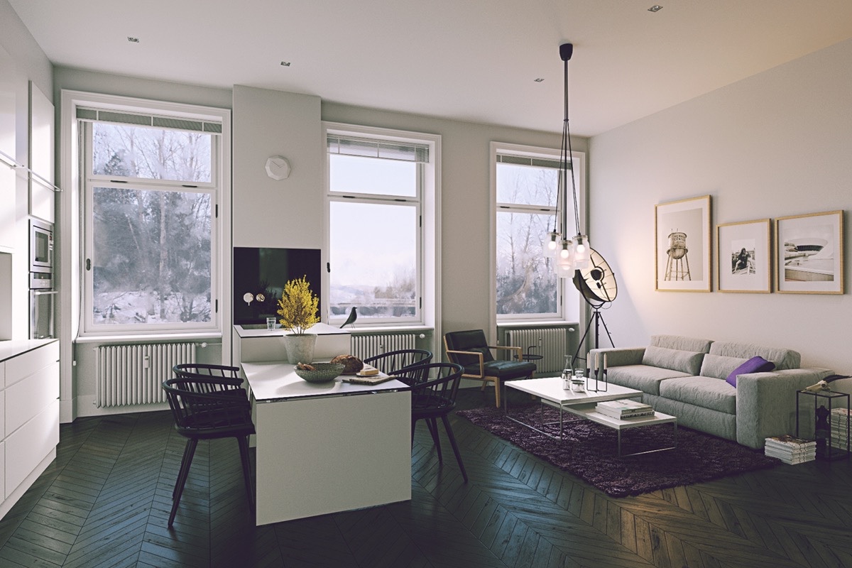
This small apartment living room dining room combo shows that modern and minimalist isn’t the only way to style such a space. Using Scandinavian style chairs, lighting with an antique flair, and a rich hardwood in a herringbone pattern, this space feels luxurious in spite of its size. Many of the features take inspiration from vintage icons, like the mid century modern clock and the Ejvind Johansson chairs.
- 5 |
- Visualizer: Zarysy
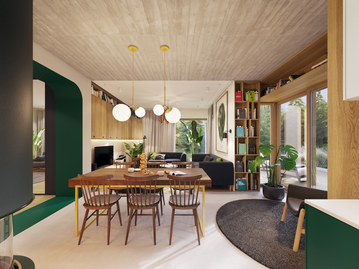
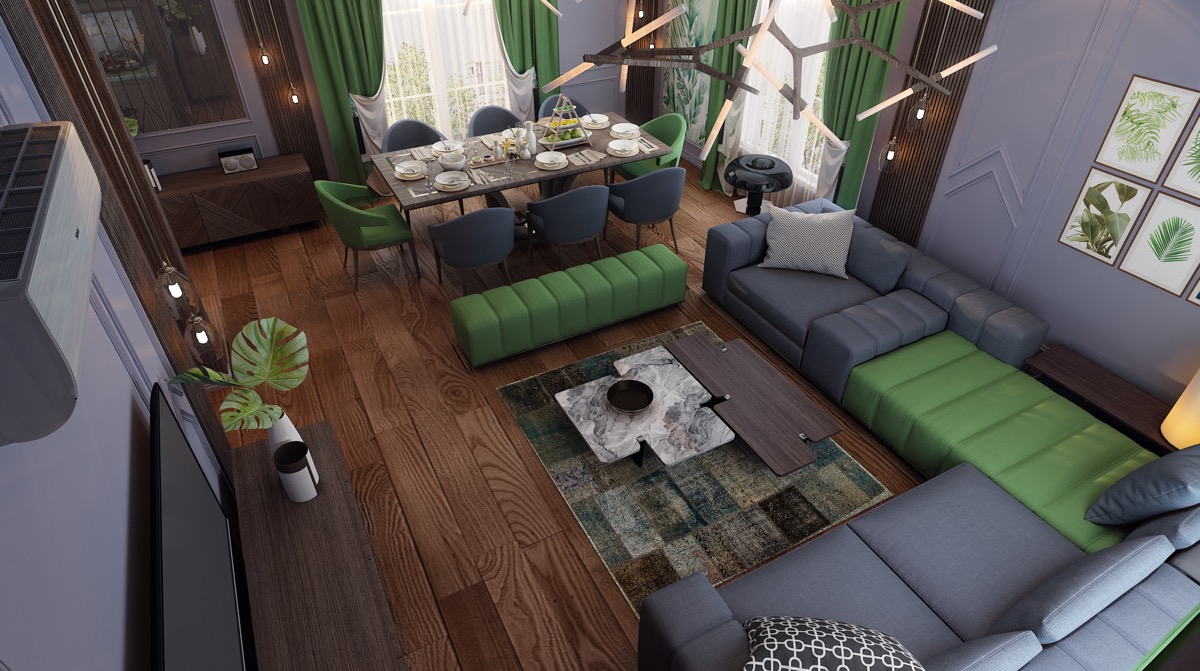
Decorating a living room dining room combo can be tricky, but this space is a great example of choosing a palette and sticking with it to create a seamless feeling between the living, dining, and kitchen areas of the apartment. The dining room pendant lights and table legs add pops of yellow while the doorways and countertops showcase a rich green.
- 6 |
- Visualizer: Novelty Sector
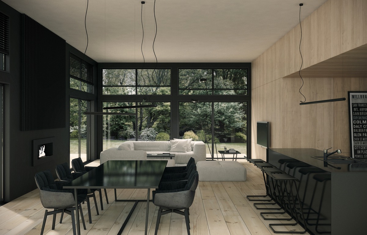
Green also takes the center stage in this palette-perfect dining and living room design. To tie both rooms together in the open space, light green and gray fabrics are incorporated into the dining chairs, sofa, and even window textiles. Using consistent fabrics is a great way to make the room look put together, even when the footprint is small.
- 7 |
- Visualizer: Romet Mets
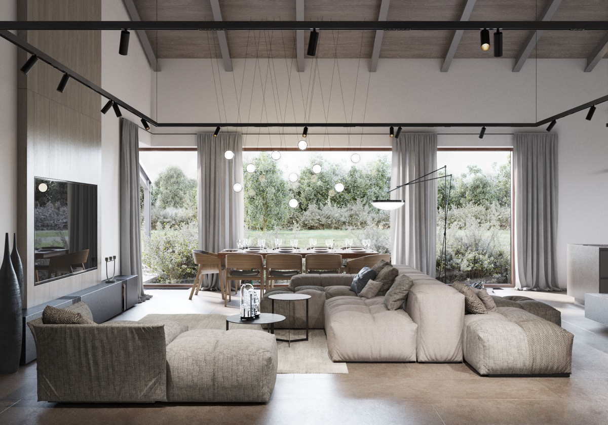
Some designers are afraid to use dark monochromatic furnishings but for this apartment, black can be used beautifully without making the space feel cramped. This sleek and modern take on the dining living room combo offers a sort of yin and yang with the use of black accents, the white sofa, and light natural woods.
- 8 |
- Visualizer: ONI Render
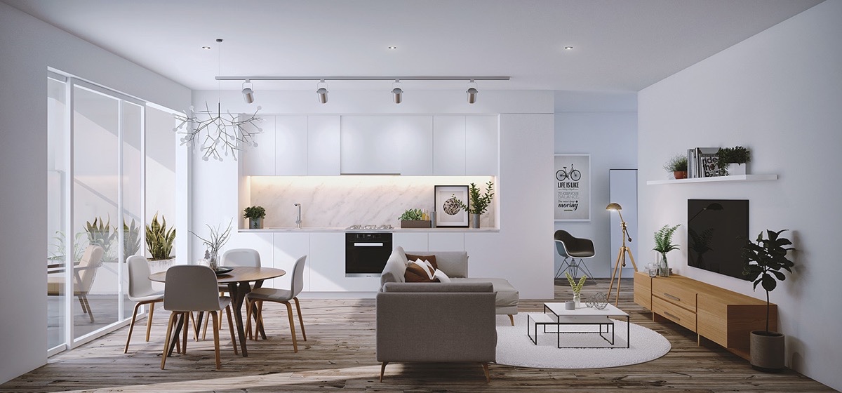
In this combination living room and dining room, light pours in through the large windows, giving the space an airy and open feel. The dining table is positioned at the window, giving a feeling of al fresco dining even when indoors. Plush, cozy seating is only steps away, making this a great example of a space for entertaining large parties.
- 9 |
- Visualizer: Ngurah Arya
In this contemporary white and gray living and dining area, light fixtures provide both functional illumination and division. In the kitchen area, a bar of lights focus toward the cabinetry, which also showcases under cabinet lighting. Over the dining table, the modern chandelier you see here is the Heracleum II LED Suspension. Pendant lighting can be an excellent way to mark the dining area of a compact but open space.
- 10 |
- Visualizer: Leo D’uk Design
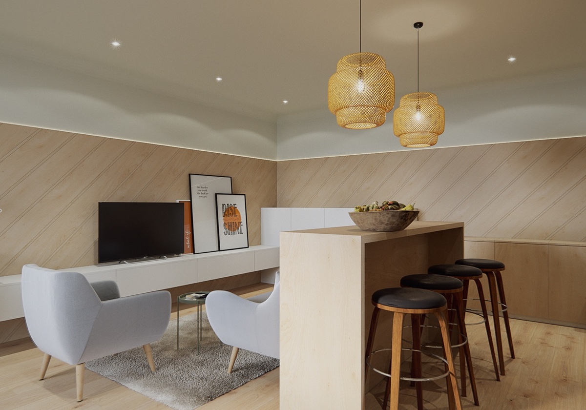
In a small dining room and living area, it’s important to make the most of your space. In this instance, we see the dining table in the form of a long bar, positioned along the back of the sofa. Both the living and dining spaces have access to the surface, which is lightened up by the suspended Ikea SINNERLIG pendant lamps above.
- 11 |
- Visualizer: K Room
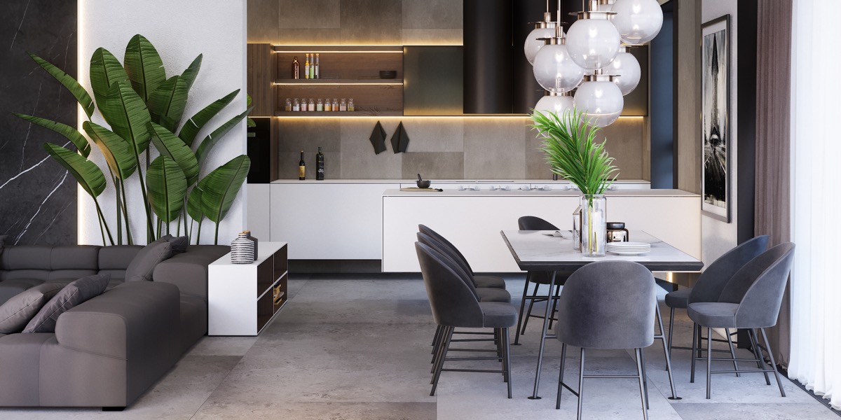
Speaking of size, this kitchen dining living room combo uses tall palms and decorative globe lights to draw the eye upward, creating an illusion of more space. Sleek stone work in the flooring and walls adds a modern flair.
- 12 |
- Visualizer: Imagine3D
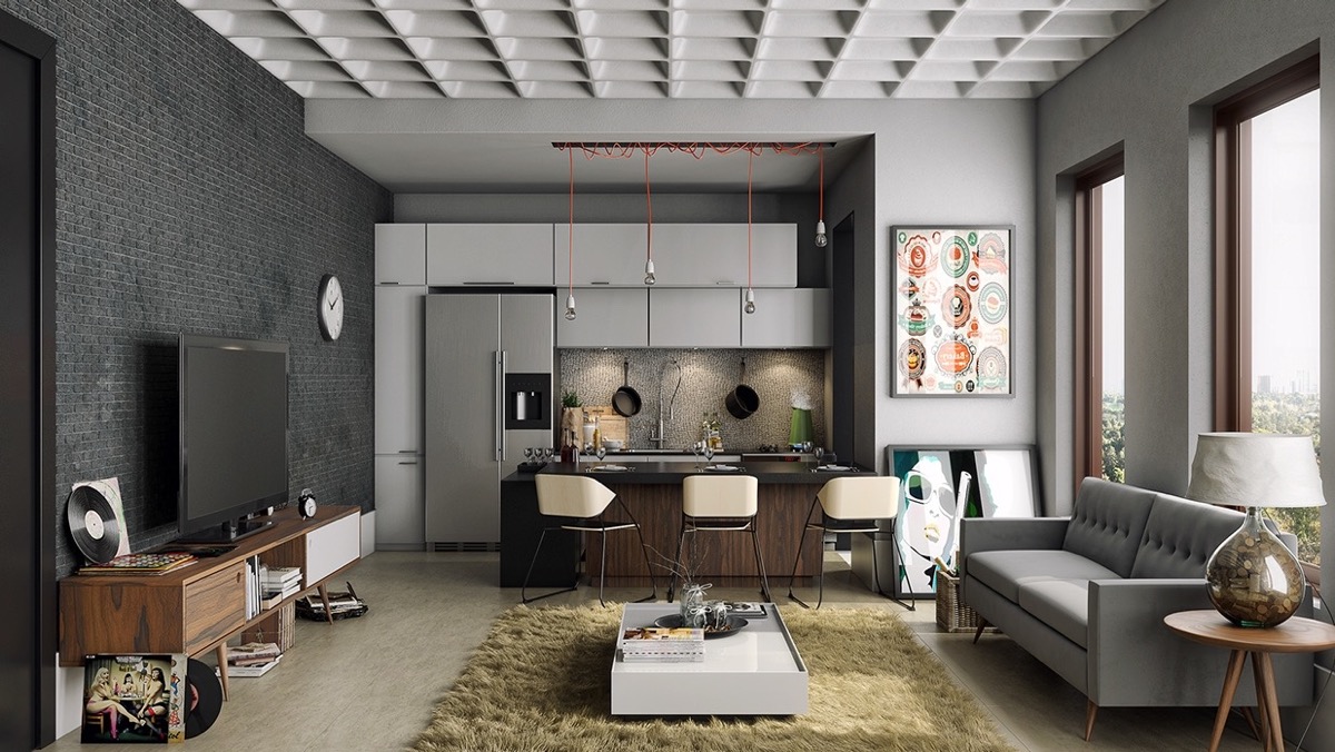
This masculine bachelor pad offers inspiration for what a studio apartment can be when you play with pattern. Textured walls, ceilings, and even the plush rug underfoot give dimension and interest to the living kitchen dining combo. Mid-century modern influence shows through certain details, like the TV stand and sofa.
- 13 |
- Visualizer: Lushviz
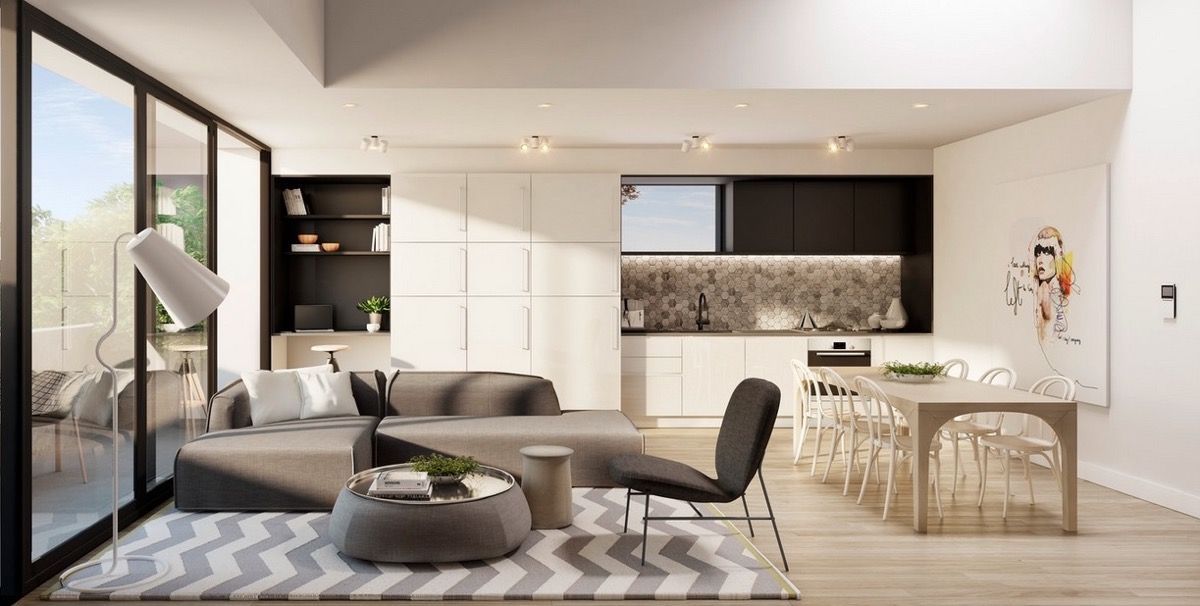
In this airy apartment with a living kitchen and dining combo, you see a unique floor lamp in the foreground that ties in with the white walls, chairs, and cabinetry. Using white to make the space feel more open was a smart design choice. The chevron rug is a bold statement piece that adds interest.

- 14 |
- Visualizer: Lushviz
This stylish open floor plan uses a long kitchen island, a pair of graphic prints, and hanging pendants to divide the room in thirds. Furniture, lighting, and artwork can all be used in this way to separate a kitchen, living, and dining combo.
- 15 |
- Visualizer: Nordico
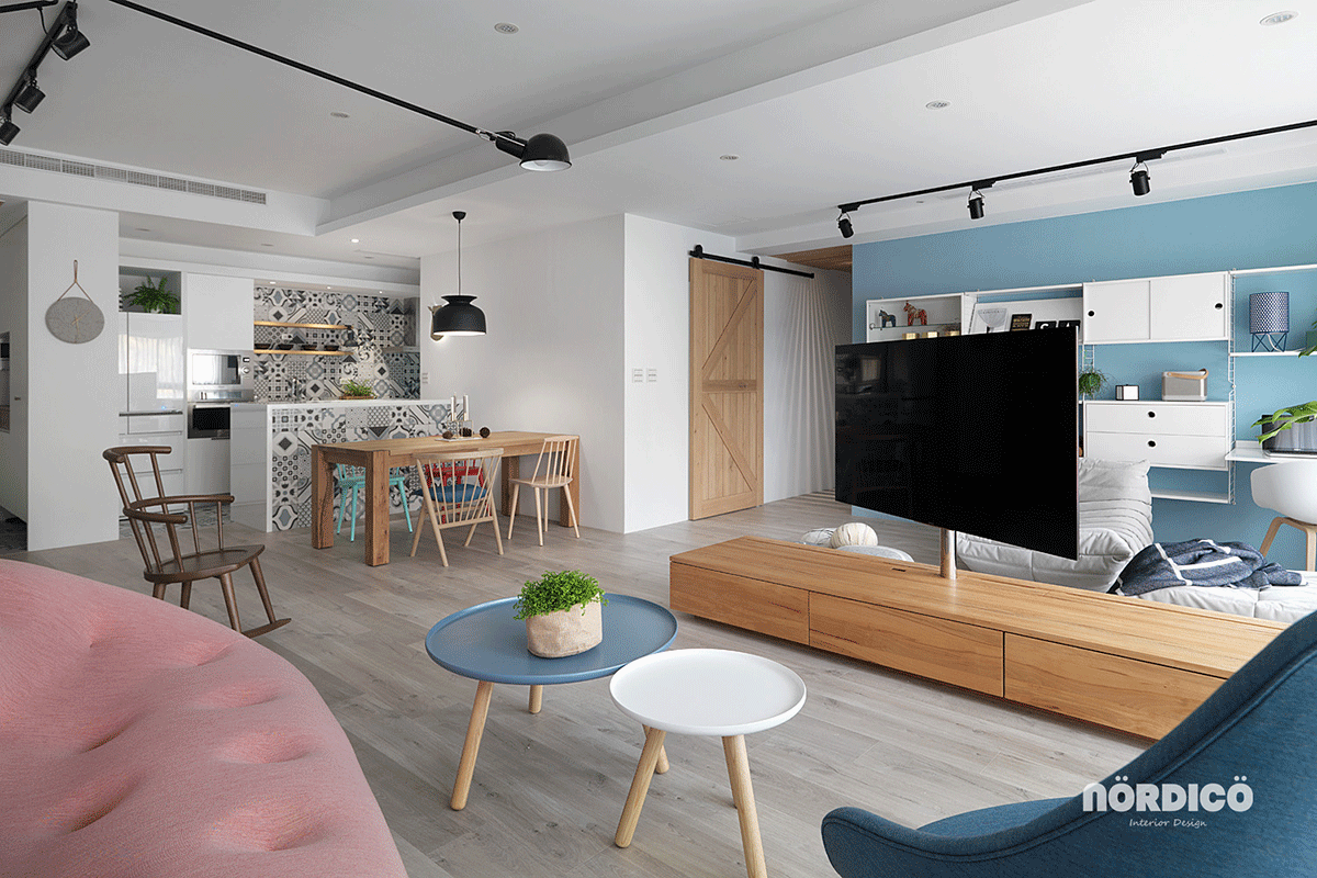
While many open floor plans may use the same wall color throughout, this example shows that accent walls can create separation. This light blue accent wall pairs perfectly with the nesting coffee table and chairs featured in the space.
- 16 |
- Visualizer: ESpace Team
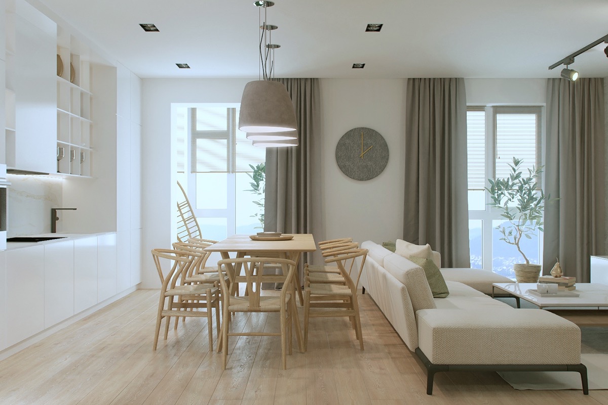
This Scandinavian apartment has almost a spa-like quality with its use of soft lighting, neutral textiles, and natural light woods, making the footprint feel less compact.
- 17 |
- Visualizer: O.M. Shumelda
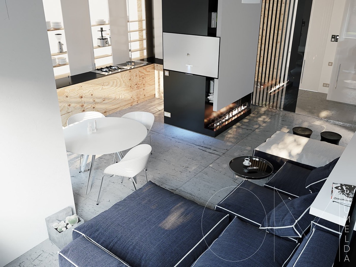
Natural woods appear in this kitchen living and dining space, both in the cabinetry and in the accent wall. Here division is created using a modern fireplace.
- 18 |
- Visualizer: Vagon Architects
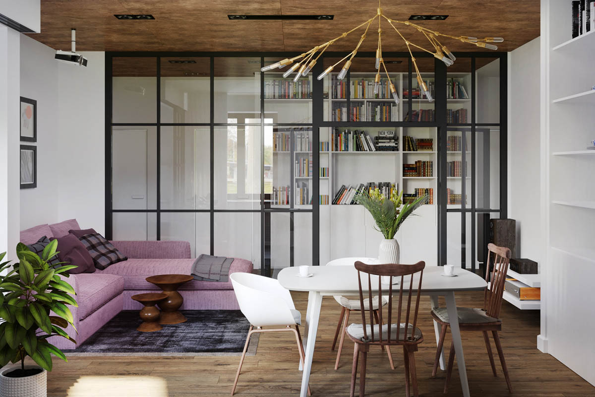
Glass and metal wall dividers can also create separation in small spaces. Here we also see the use of mixed furniture styles in both the sofa (bright) and the https://www.archvagon.com/ dining table chair combination (traditional meets modern).
- 19 |
- Designer: 2B Group
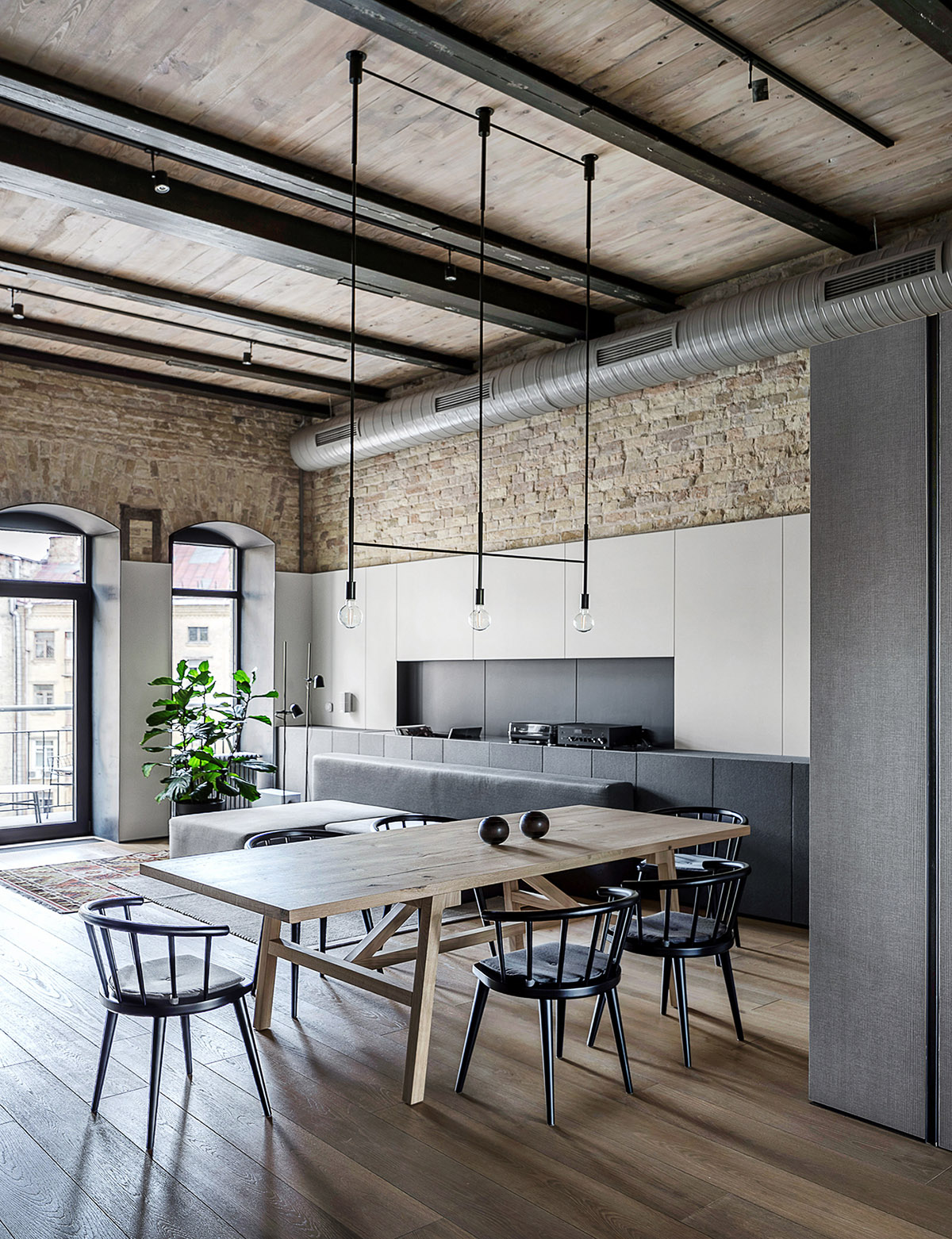
Ample wall storage is a wonderful way to make the most of a small space like this, which we see here in the use of tuxedo cabinetry that runs from floor to the near top of the tall windows.
- 20 |
- Visualizer: Javier Wainstein
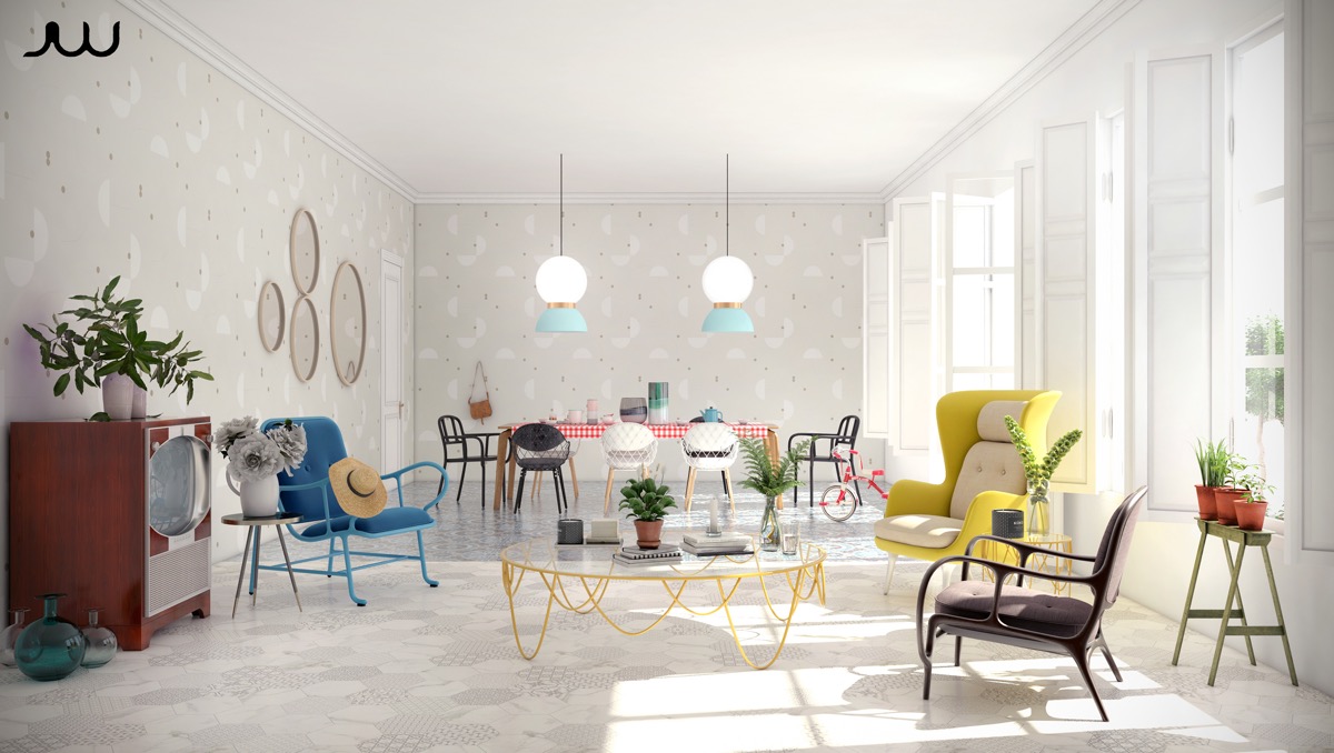
Wallpaper isn’t something to shy away from in compact floor plans either. In this apartment, a subtle wallpaper print adds visual interest without crowding the walls with art, letting the bright furniture take center stage.
- 21 |
- Designer: Annabell Kutucu
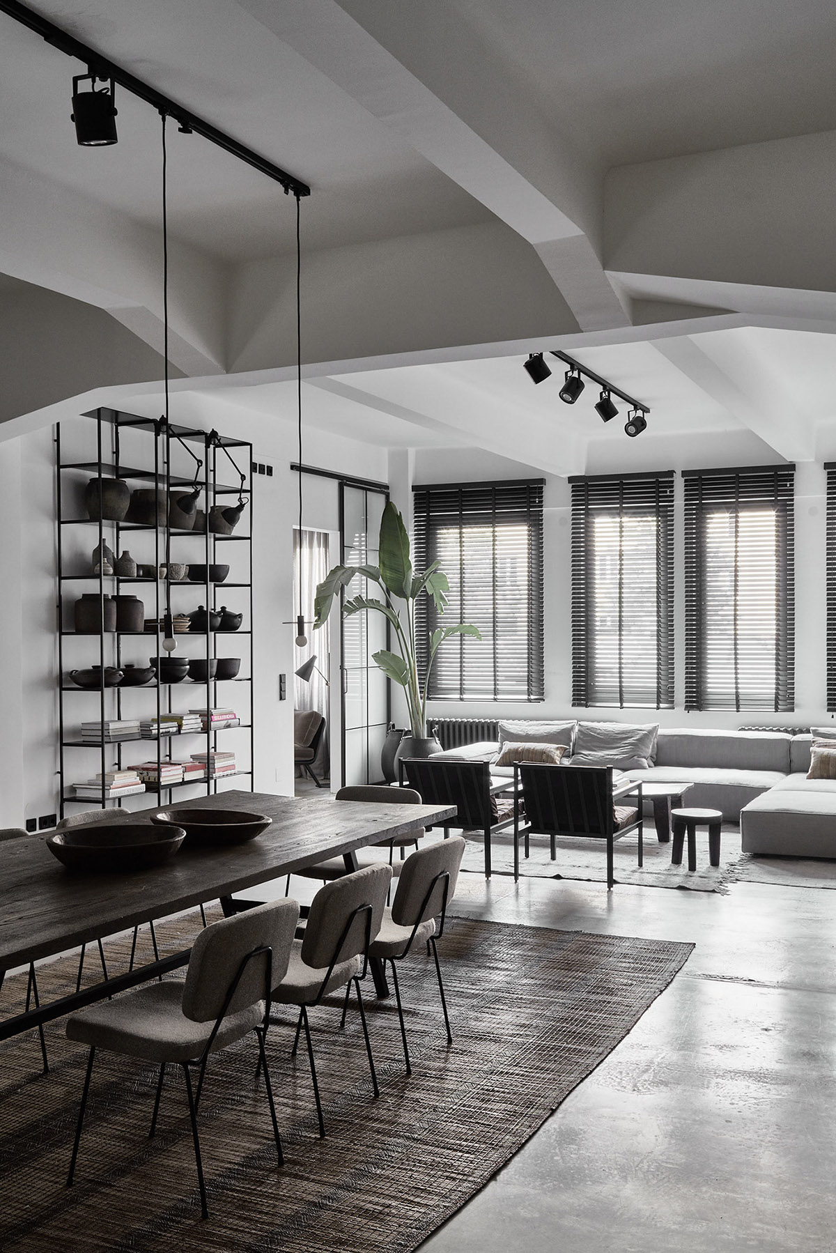
In this modern open concept living and dining room, wall shelving in the same black matte metal in the chairs and pendant lighting provides a dividing visual line between the dining table and seating area.
- 22 |
- Visualizer: Fenix Design
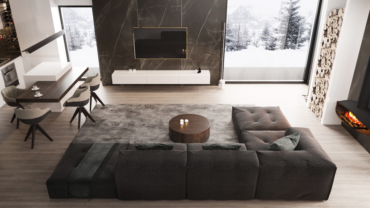
Richer tones can work well in open floor plans too, as evidenced by the cushioned sectional, dark woods, modern dining chairs, and marble accent wall of this interior. The location of the fireplace is also unique here, allowing for the seating to be focused on either a roaring fire or a favorite TV program easily. The wood storage also provides a unique decorative touch.
- 23 |
- Visualizer: Konstantin Entalcev
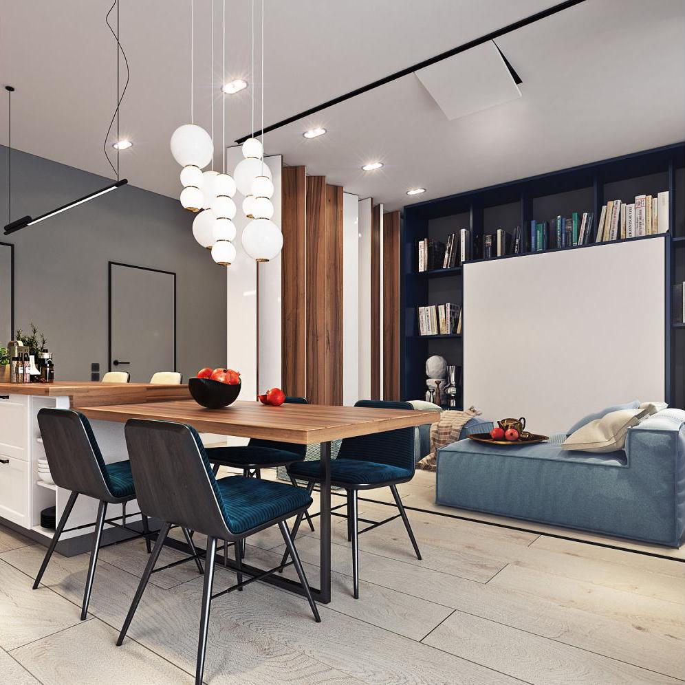
Smart design for compact spaces can also incorporate moving walls that slide on tracks mounted to the ceiling, expanding furniture, or other items that can be tucked away neatly. You can also see this concept executed well in the unique transformer layout of this home.
- 24 |
- Designer: The November
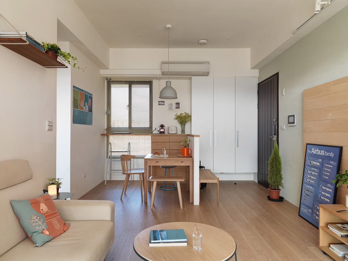
Touches of greenery in the form of houseplants make this space feel lively and welcoming. They too can be used to make an open floor plan feel more finished.
- 25 |
- Visualizer: Maxim Tsiabus
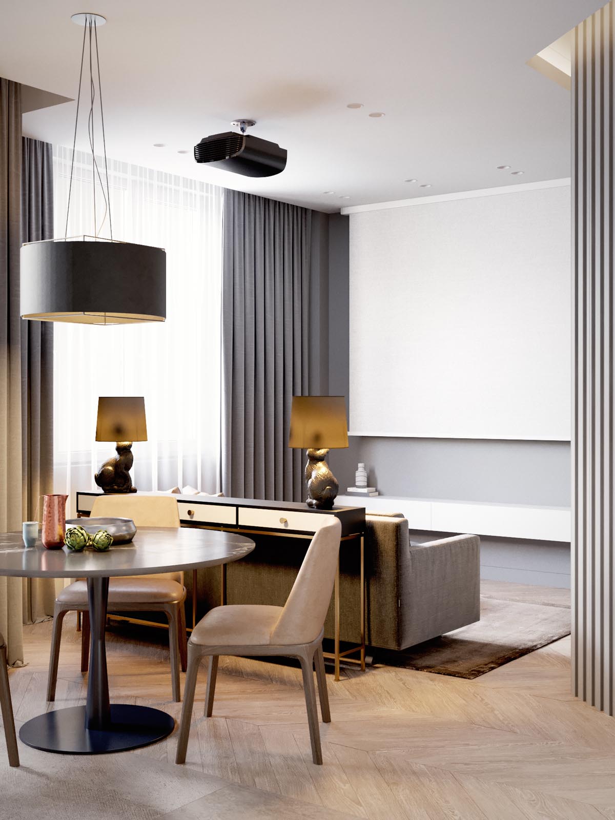
In the minimalist design of this home, the console table with Rabbit lamps provides a makeshift room divider that separates out the dining from the living while still leaving room for entertainment. The large projector screen offers a full view from any vantage point.
- 26 |
- Visualizer: Rustem Urazmetov
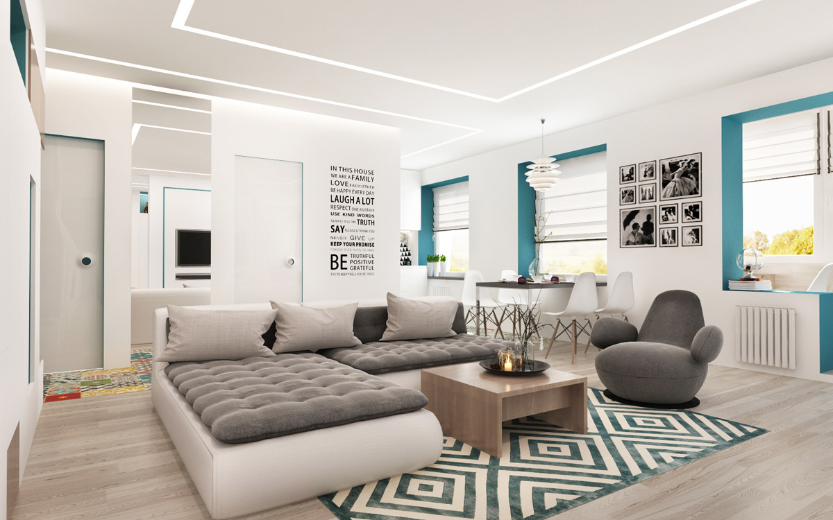
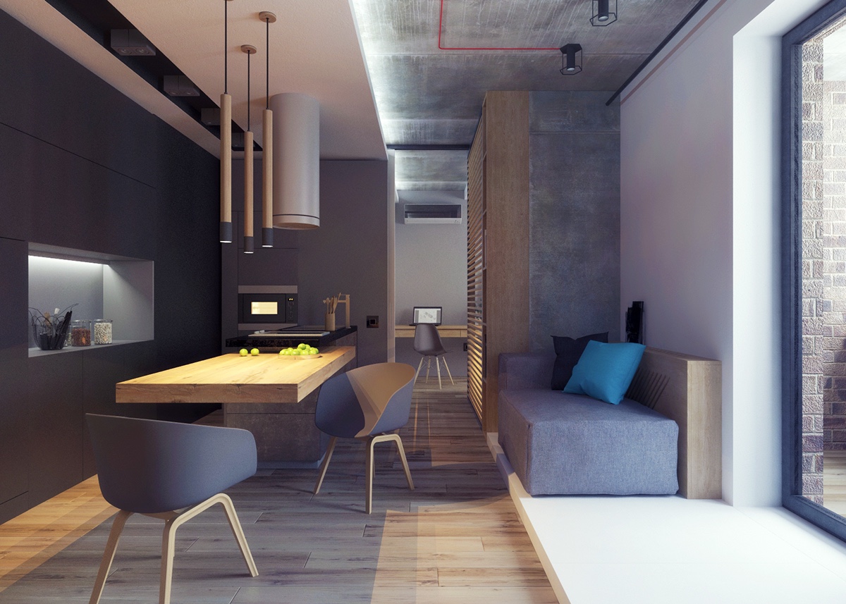
Window and door frames can also be a great place to tie in color accents in an open floor plan, as seen here. Pops of blue in the frames work beautifully with the plush sectional, modern accent chair, and boldly patterned rug.
- 27 |
- Visualizer: Nikita Bulatov
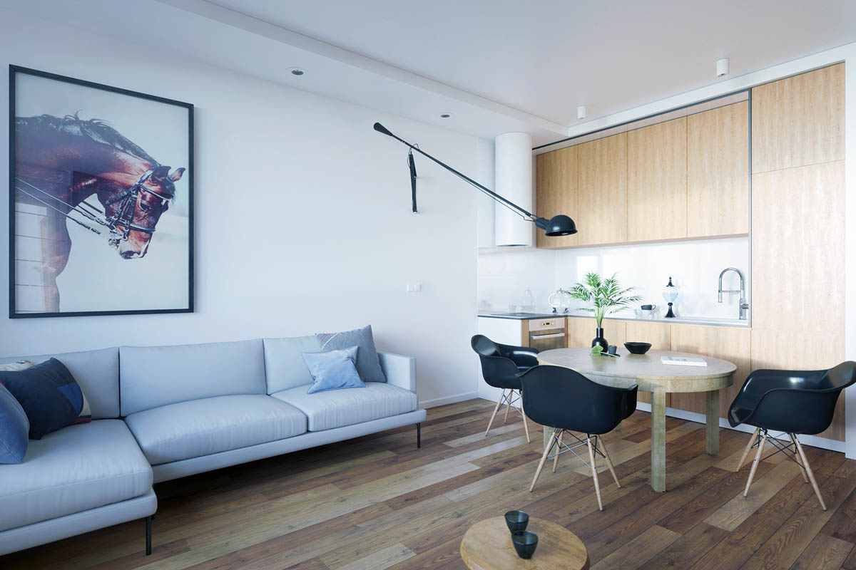
In this contemporary apartment, a grey living room shows that you’re not limited to whites or neutrals for paint colors. Paired with the light hardwoods and overhead lighting, it feels very sleek and polished.
- 28 |
- Visualizer: Norik Karavardanian
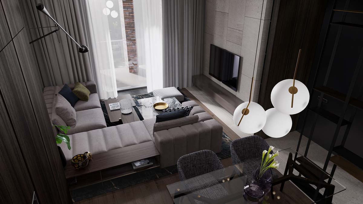
A long armed pendant lamp can also be a unique way to divide a living and dining room in a studio like this one.
- 29 |
- Visualizer: Dmitriy Kurilov
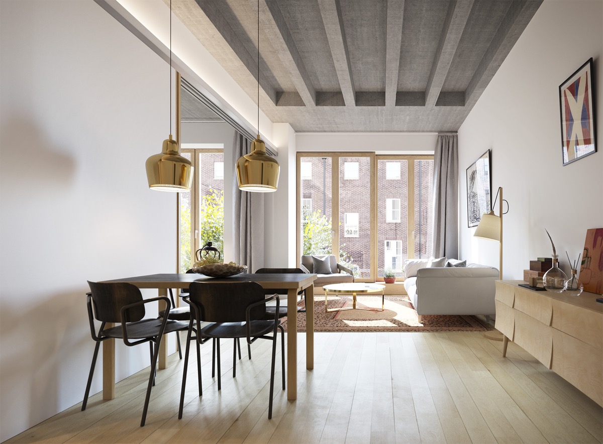
Seating position also works to define an open space. The light gray modular sofa draws the eye toward the living area and large window while globe pendant lights make the dining area feel more apparent.
- 30 |
- Visualizer: Recent Spaces
Drawing the eye upward toward the ceiling with a unique finish can also make a living and dining room combination feel roomier, as seen here.
- 31 |
- Visualizer: Afina Portobello
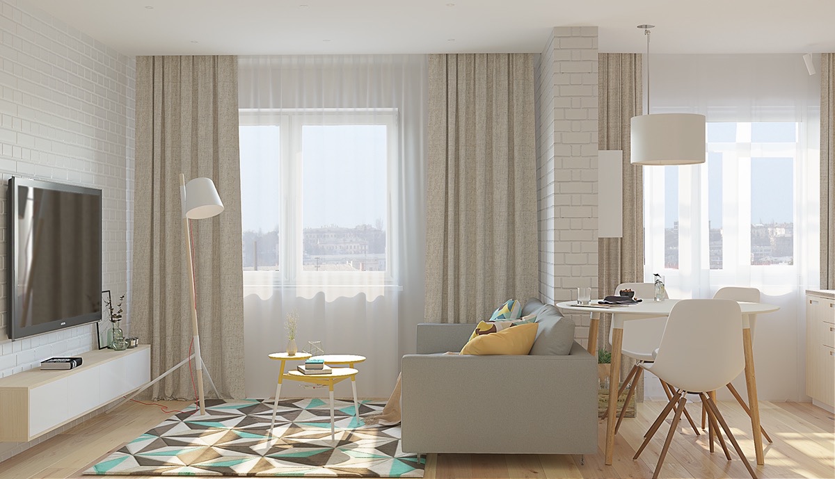
In this light and bright Scandinavian living room, a graphic rug and throw pillows add pops of color to the otherwise neutral palette being used throughout the small space. To add to its feeling of lightness, walls, furnishings, and even light fixtures share a color palette.
- 32 |
- Visualizer: LVI Studio
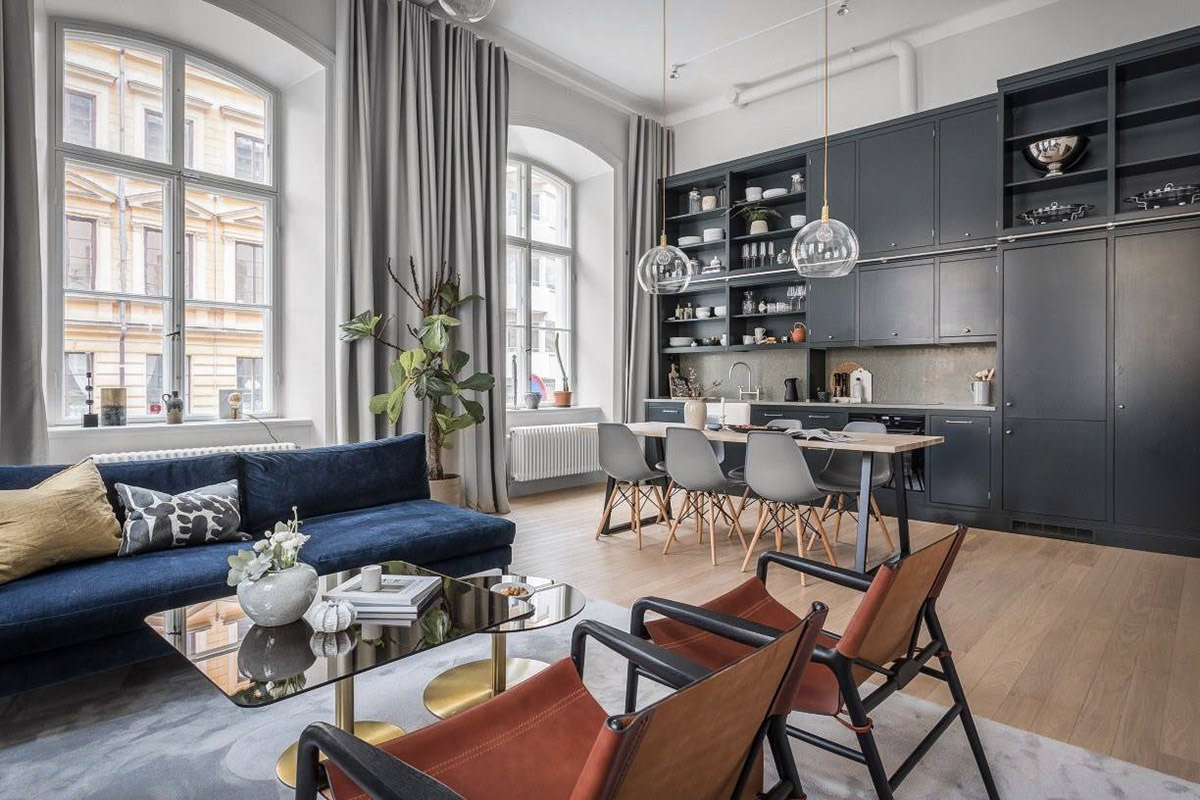
In tight spaces, vertical storage can reign supreme and here we see an example of cabinetry becoming a statement accent wall with open shelving and three layers of cabinetry. Window drapery acts as a room separator.
- 33 |
- Visualizer: Hung Le
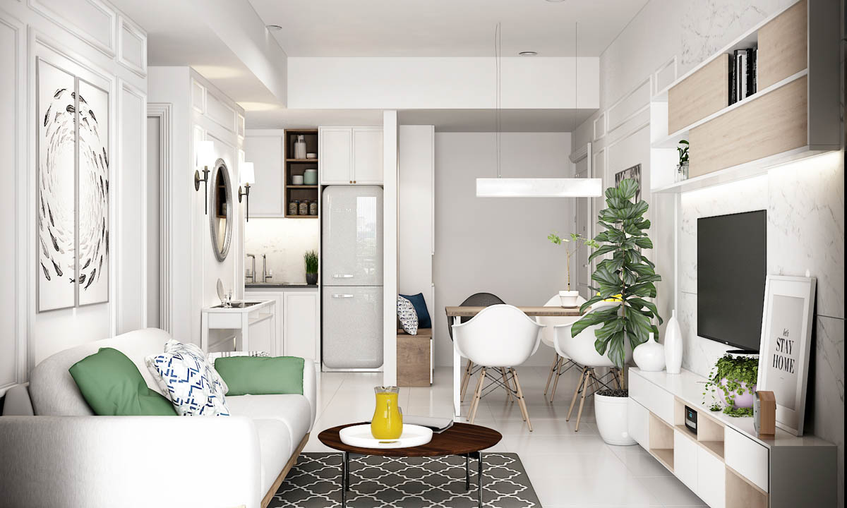
In this compact apartment layout, we see built-ins in the kitchen to stash appliances – a clever way to maximize space. Pops of green through throw pillows and indoor plants add freshness.
- 34 |
- Visualizer: Diễm Kiều
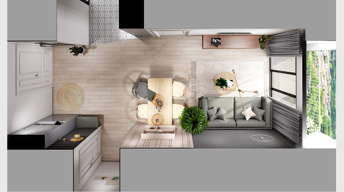
In this overhead view of a combination living and dining area, separation is achieved through wall accents and natural greenery positioned alongside the sofa.
- 35 |
- Visualizer: Diễm Kiều
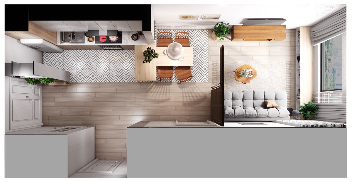
In this visualization however, we see a sliding wall panel that may be drawn to provide privacy to the seating area. Additionally, the dining area sits on the unique tile flooring seen in the kitchen.
- 36 |
- Visualizer: aTng 糖 & Dunqiang Chen
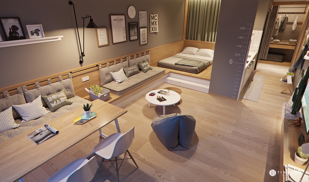
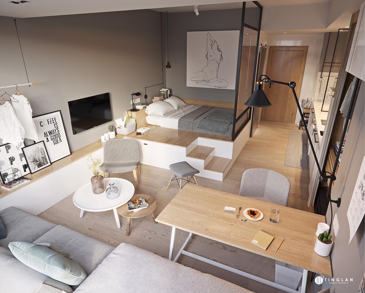
This earthy studio apartment creates a sense of calm by using a layout that flows in terms of relaxation and positioning. The dining area sits at the forefront, the living area in the middle, and then the slightly raised sleeping area at the back.
- 37 |
- Visualizer: 敦强 陈
We see a similar approach taken in this one room apartment design that blends together living and dining seating into one long bench positioned opposite the raised bed area.
- 38 |
- Visualizer: Respix Studio
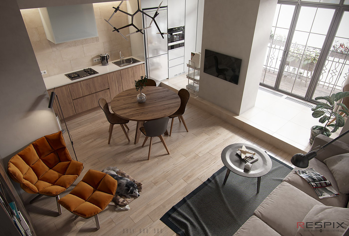
In this compact space, a center wall positioned in the kitchen provides division while letting light stream through the floor to ceiling balcony windows.
- 39 |
- Visualizer: Maksym Netreba
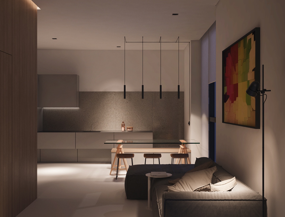
While natural light is a way to make a small space feel lighter, monochromatic palettes with soft lighting can be a great way to create small space luxury.
- 40 |
- Visualizer: Z.Design architecture
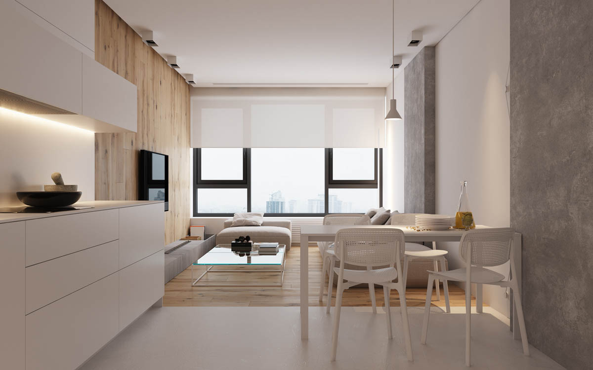
Clean lines in cabinetry, floor, ceiling, and even window treatments give this minimalist dining and living area a sleek sophistication.
- 41 |
- Designer: The November
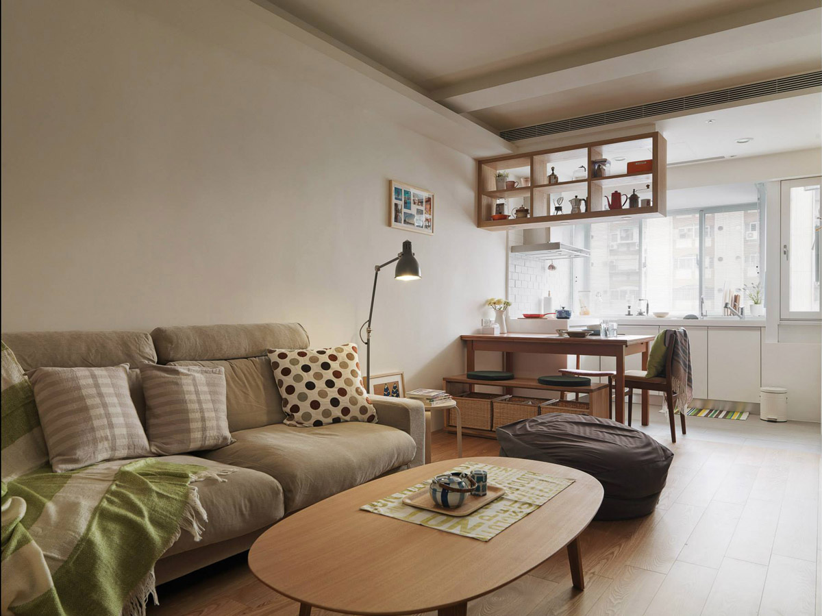
But achieving an attractive living room and dining room doesn’t have to be high style. Here, we see cozy touches in the form of throw blankets, a bag chair, and cute tea set in a much more casual and accessible setting.
- 42 |
- Visualizer: Evgeny Garchu
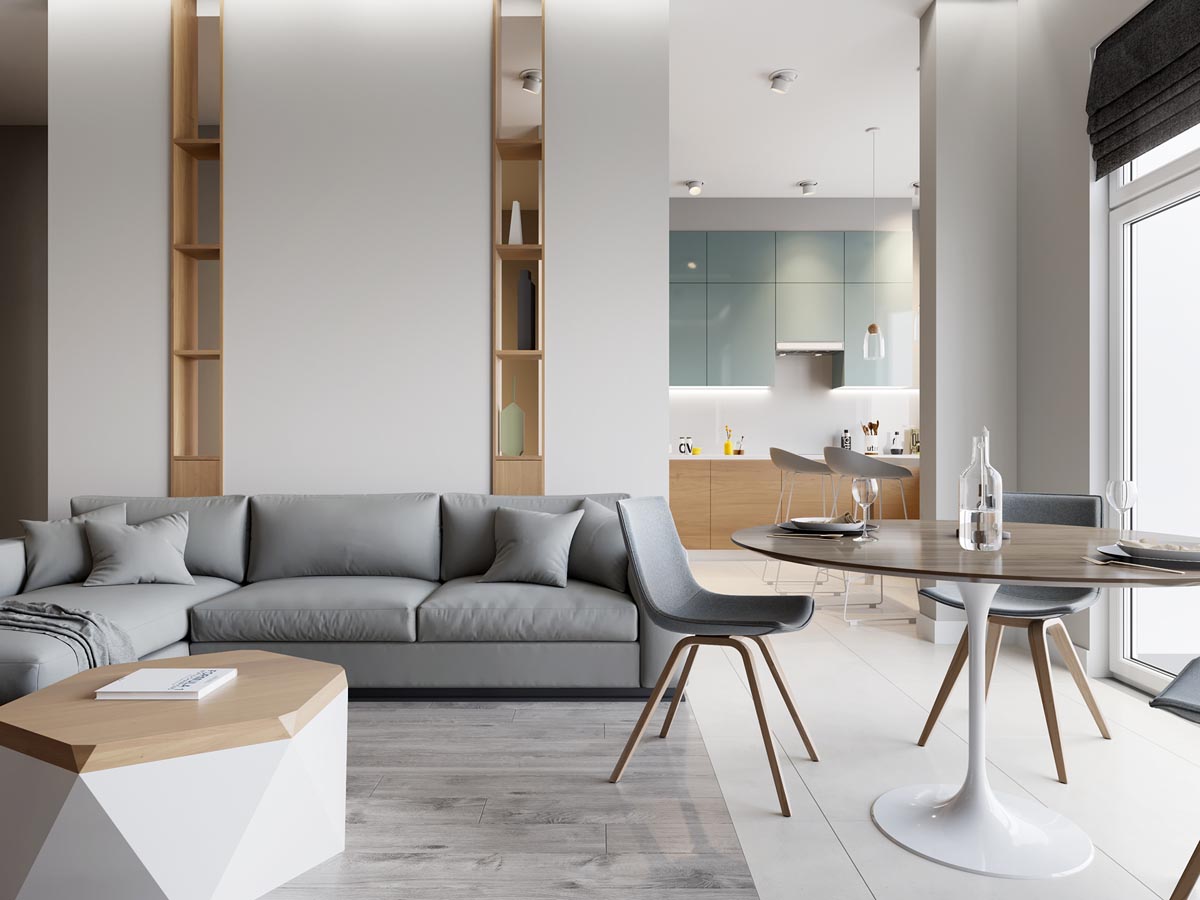
Geometry can also be a powerful ally in creating a living and dining room combination that feels fresh. The geometric coffee table and narrow vertical built-ins are unexpected additions to anchor the room.
- 43 |
- Visualizer: Atom studio
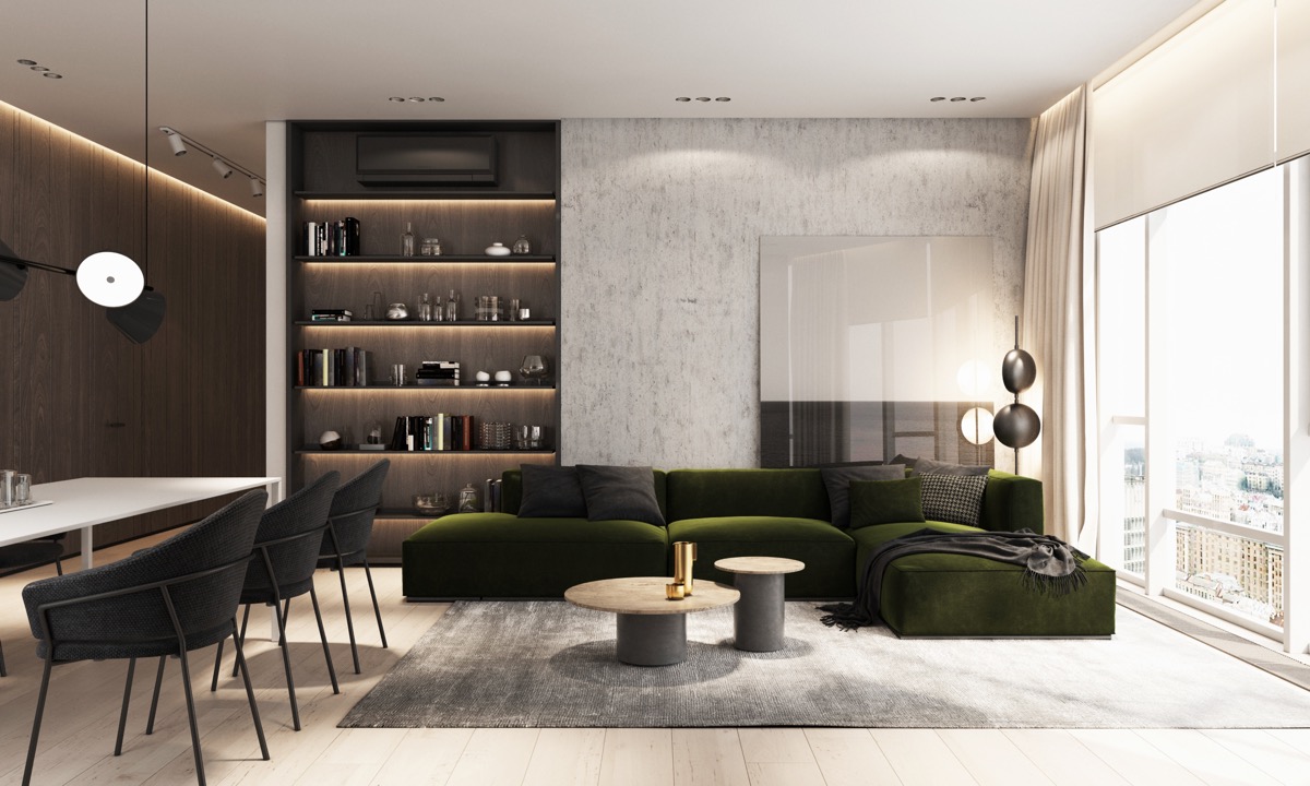
In this sleek and stylish open floor plan apartment, mid century modern touches give the overall design a contemporary feel. The mossy green sectional is particularly striking addition to the space.
- 44 |
- Designer: HAO Design
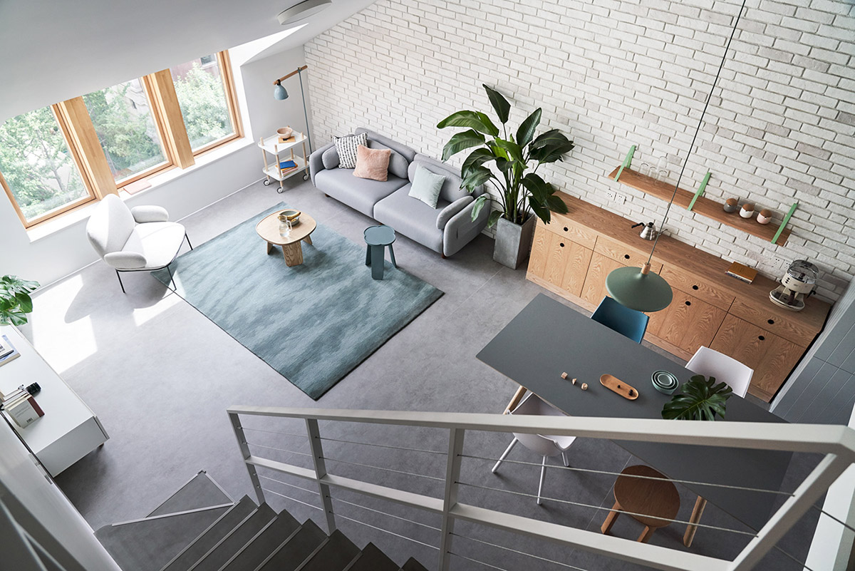
Rugs are also practical solutions for creating an area that feels designated. Here we see a charcoal palette broken up by warm woods, white, and pops of teal, which can be also found in the living room rug.
- 45 |
- Source: gyunexX
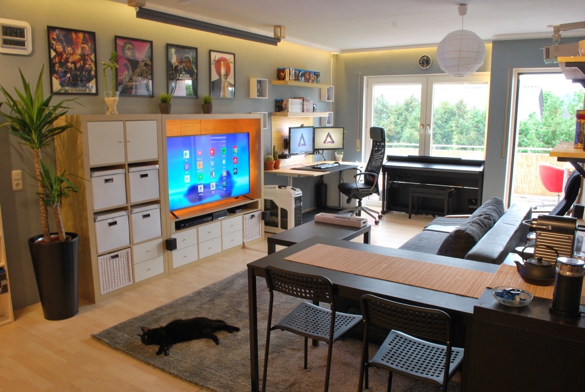
Entertainment can also be used to create a feeling of “rooms” in a compact apartment layout, as seen here with computers, an electric piano along the window, and a large media console.
- 46 |
- Architect: Dermice Architects
- Designer: Anna Fedyukina
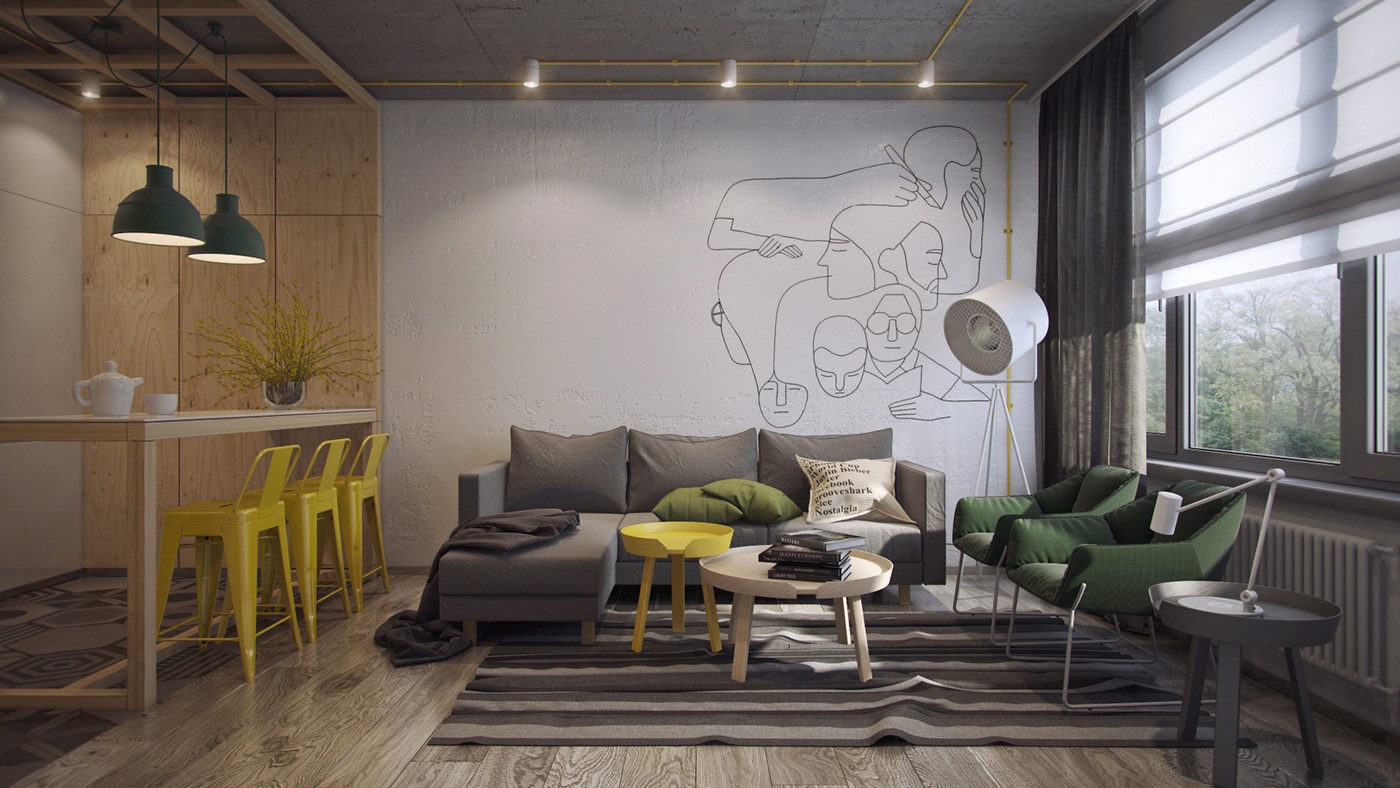
In this creative living room and dining room design, we see a well coordinated palette of green, yellow, and gray to tie both rooms together. To create a feeling of division, wood accents run along the wall and ceiling without taking away from the strong visual of the painted white accent wall.
- 47 |
- Visualizer: Cartelle Design
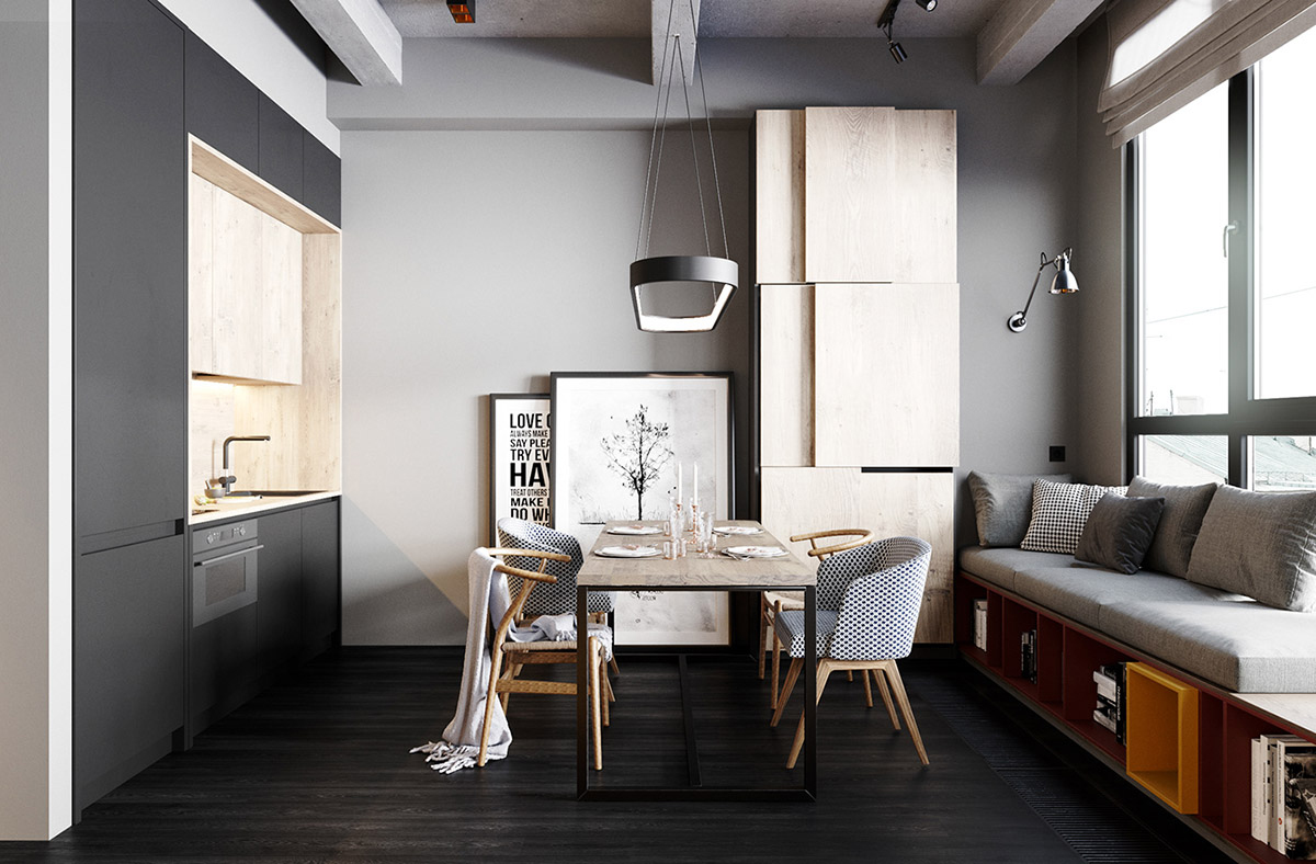
One room living shouldn’t feel crowded or cramped as long as space is used smartly. Here, we see clutter eliminated by offering storage space in the form of under bench cubbies and large vertical cabinets.
- 48 |
- Visualizer: Zikzak
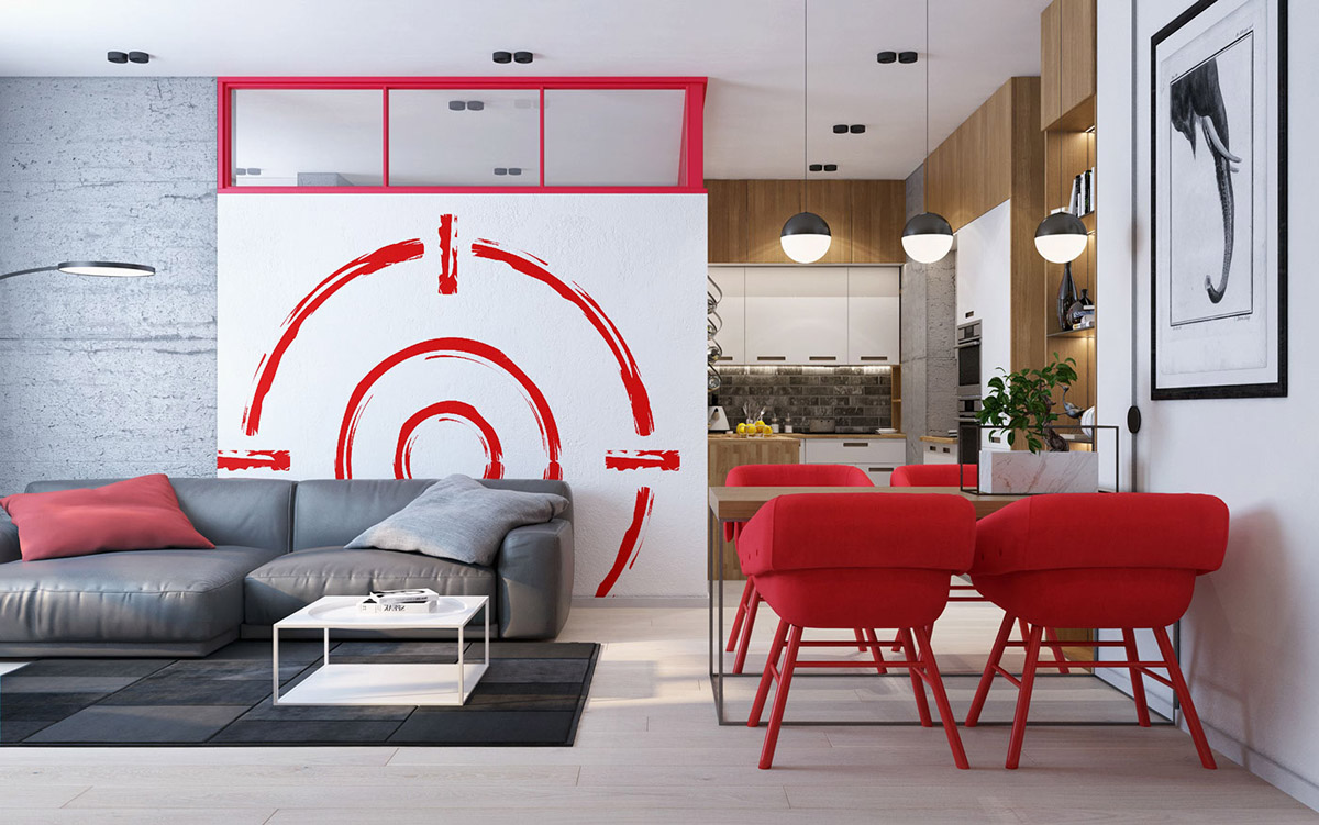
Small spaces are also good for taking risks with bold design choices, as seen here with the use of red in the art and furnishings.
- 49 |
- Designer: Ivan Yunakov
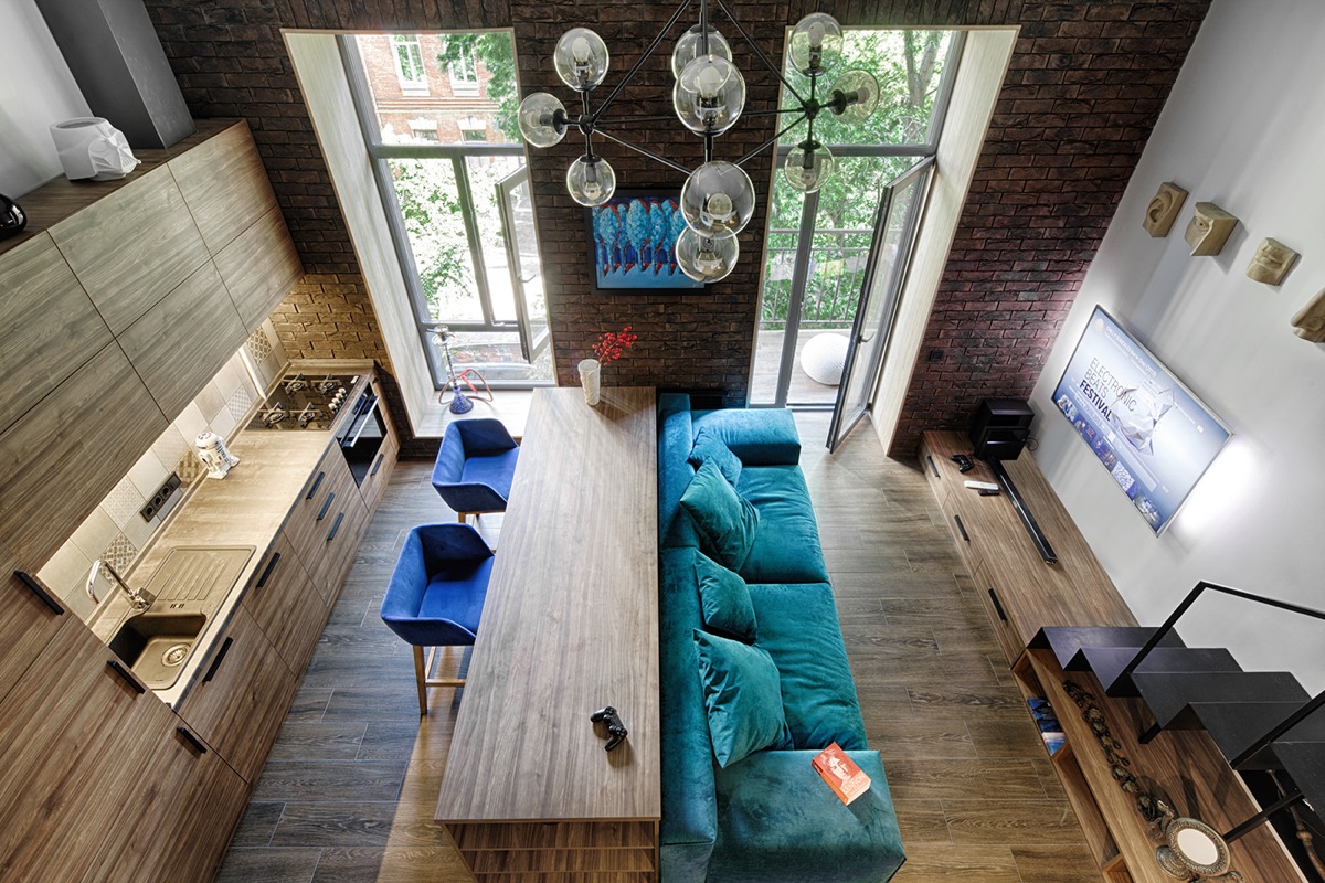
Using a dining table as a console table can be a clever way to also make use of a combination living and dining room.
- 50 |
- Visualizer: Maksim Demchenko
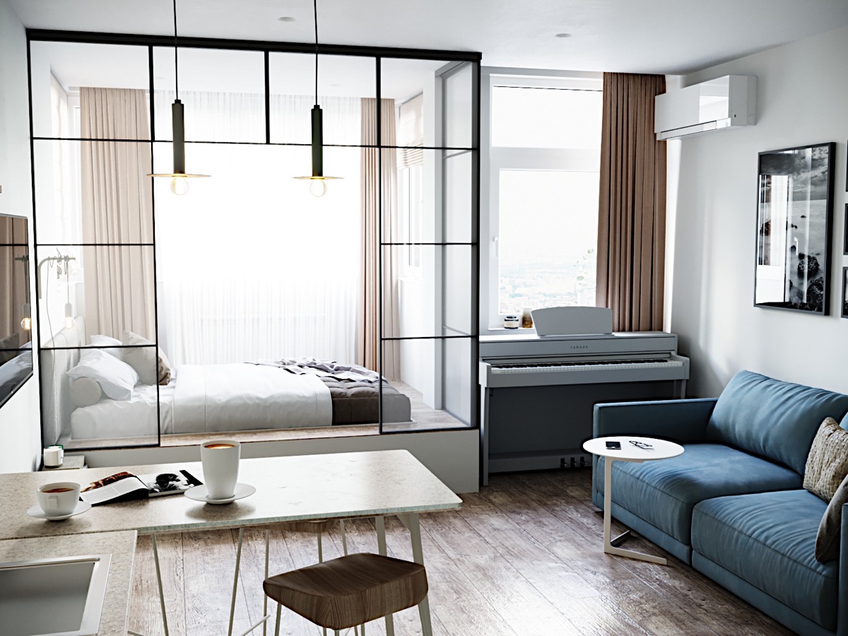
Modern one room studio apartments with little space for separation can be given structure by using see through enclosures or textiles where you’d like to add a bit of privacy.
- 51 |
- Source: Husman Hagberg
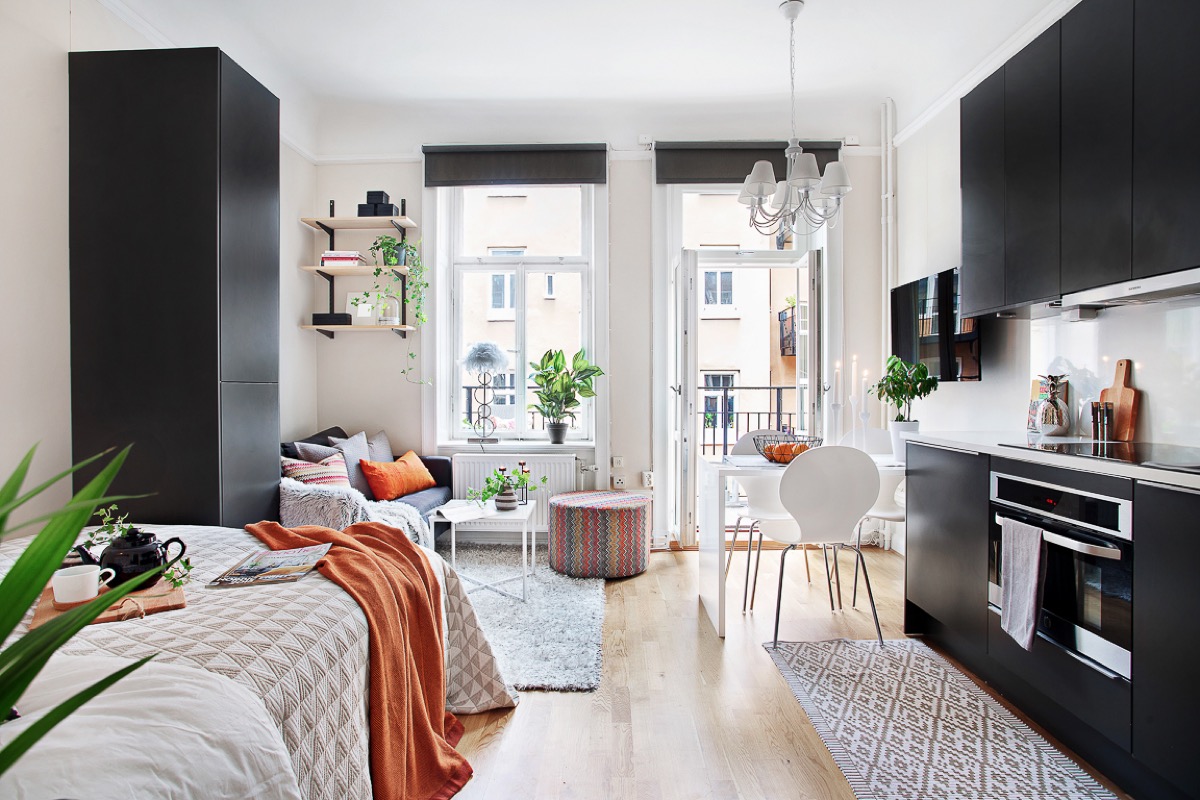
But regardless of the space, having a combination living and dining room – or even a one room studio – can be made beautiful by playing with light, color, texture, and unique touches that make the space your own.
