- 1 |
- Source: Lagabe
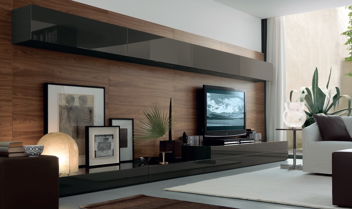
This wall and base unit combo is mounted against a wood panel backdrop, which visually holds the entire arrangement together. The TV is mounted to one end of the long console, with the opposite side being used as the ideal place to display a few favourite art prints lit by designer lamps.
- 2 |
- Source: Lagabe
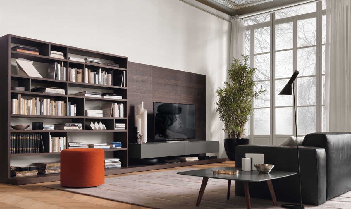
The wood panel behind this TV runs up against a tall bookcase of matching wood tone.
- 3 |
- Via: Isabel Miro
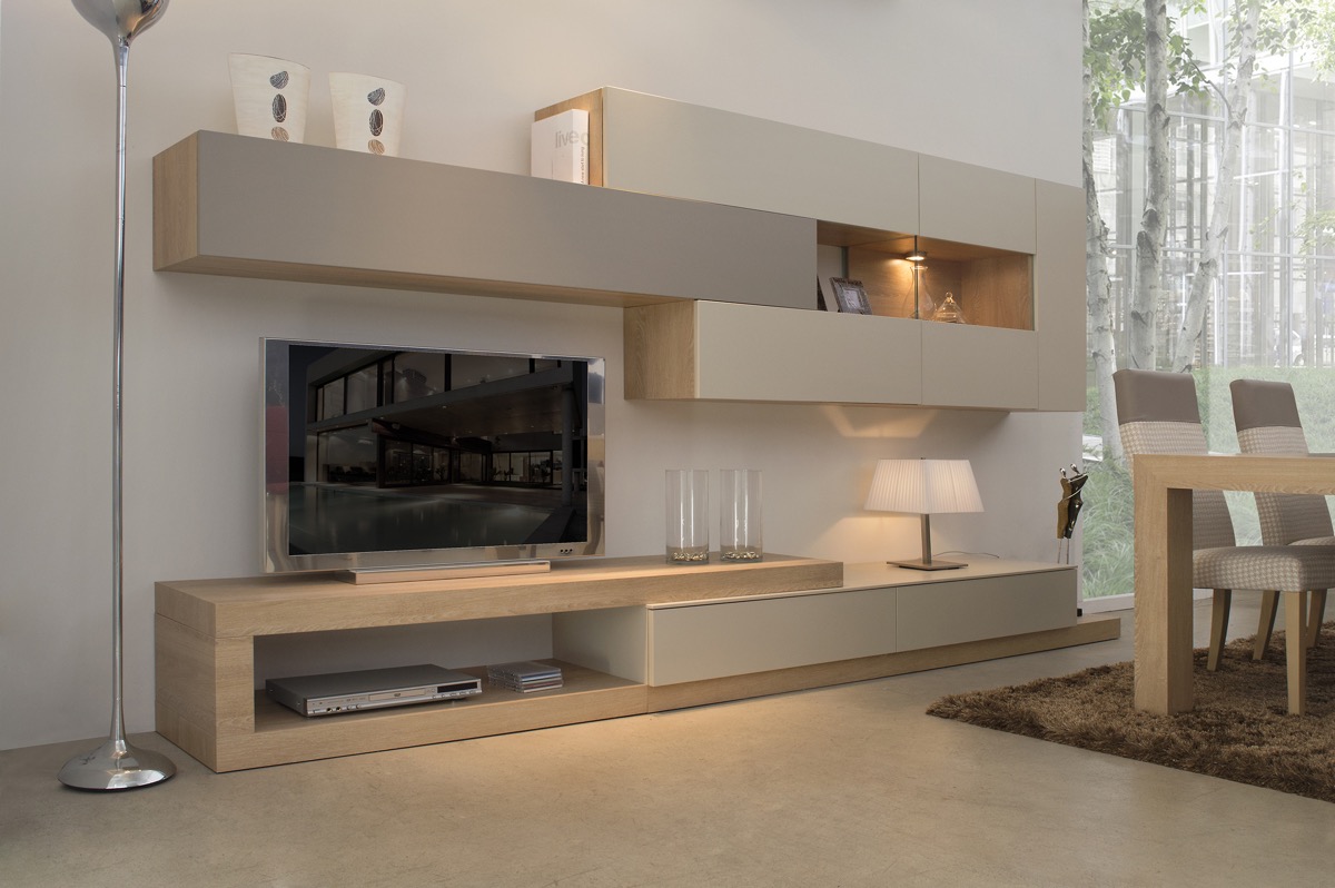
Due to the slimline storage space requirements of a media console unit, layouts can get creative. This offset alignment gives the illusion of sliding volumes, pulling away to leave display nooks.
- 4 |
- Visualizer: FOG Architecture
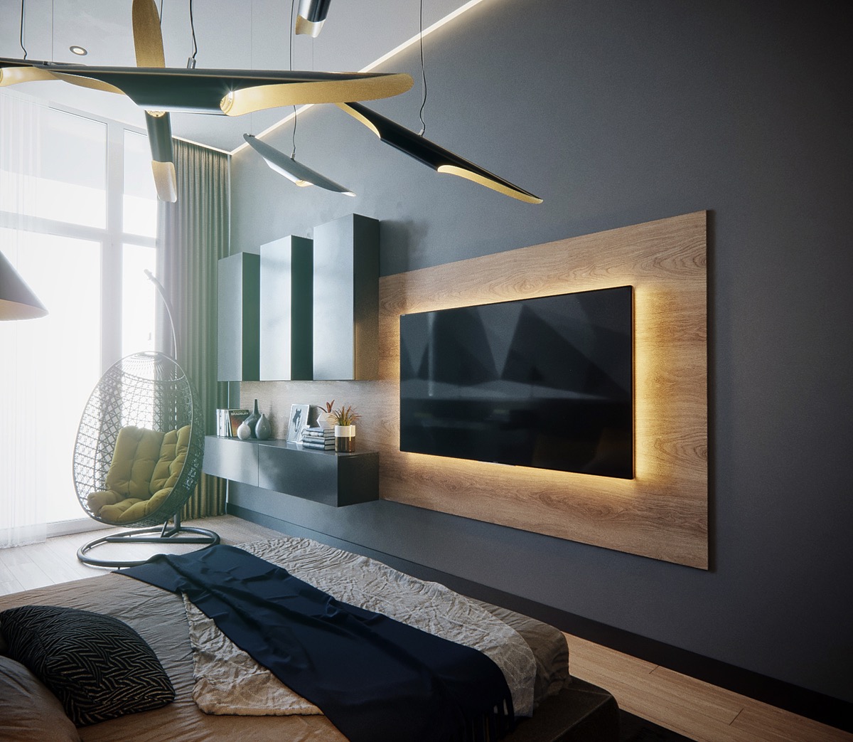
This backlit television makes a feature of its woodgrain mount even when the screen is not in use. A block arrangement of media units to the side creates a place to display decorative and treasured items.
- 5 |
- Visualizer: Snuper Design
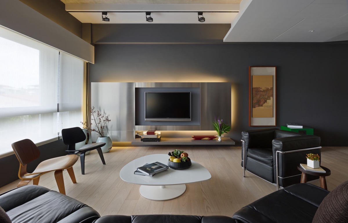
In this living room, not just the television but the TV wall panel itself is backlit. The feature provides a lovely cosy glow, in lieu of a traditional flame fireplace. The low shelf at the base of the installment is reminiscent of a hearth too.
- 6 |
- Visualizer: Hung Le
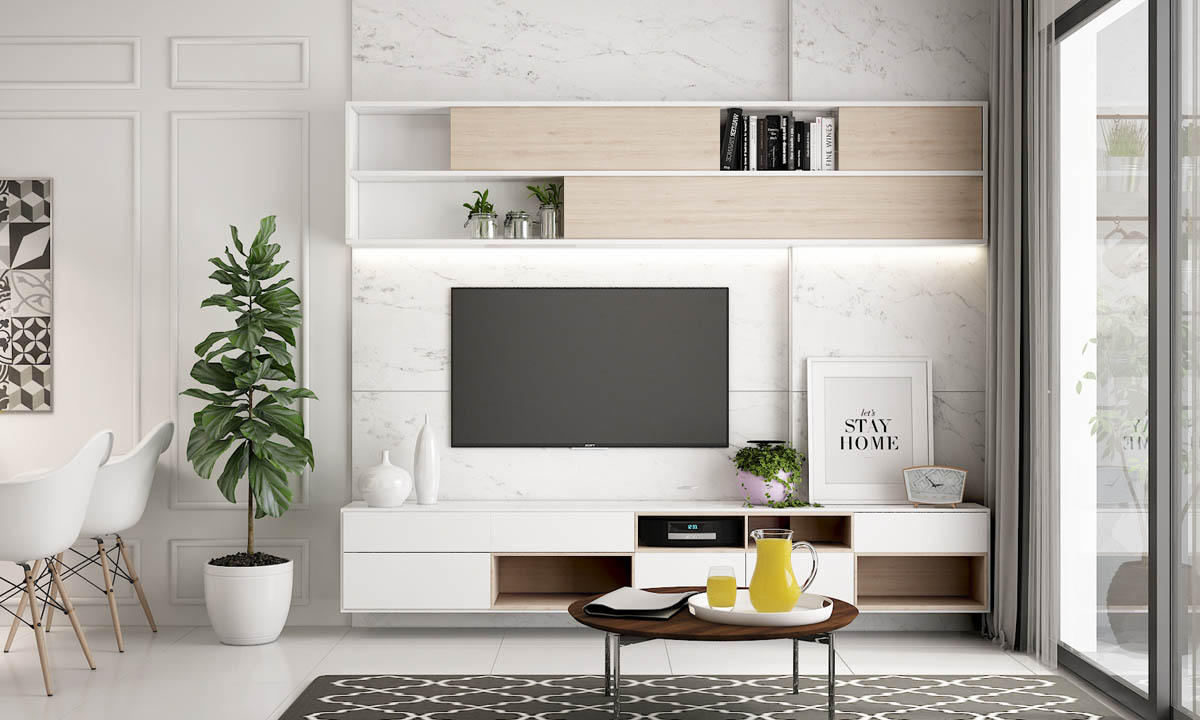
Wall mounted units are a popular choice for a TV wall. Uninterrupted floor space looks clear and tidy; the room looks more spacious and is also easier to clean. The LED lighting strip that runs beneath the upper unit in this particular arrangement adds to the look of weightlessness, as well as illuminating display items beneath.
- 7 |
- Visualizer: Ngoc Nguyen
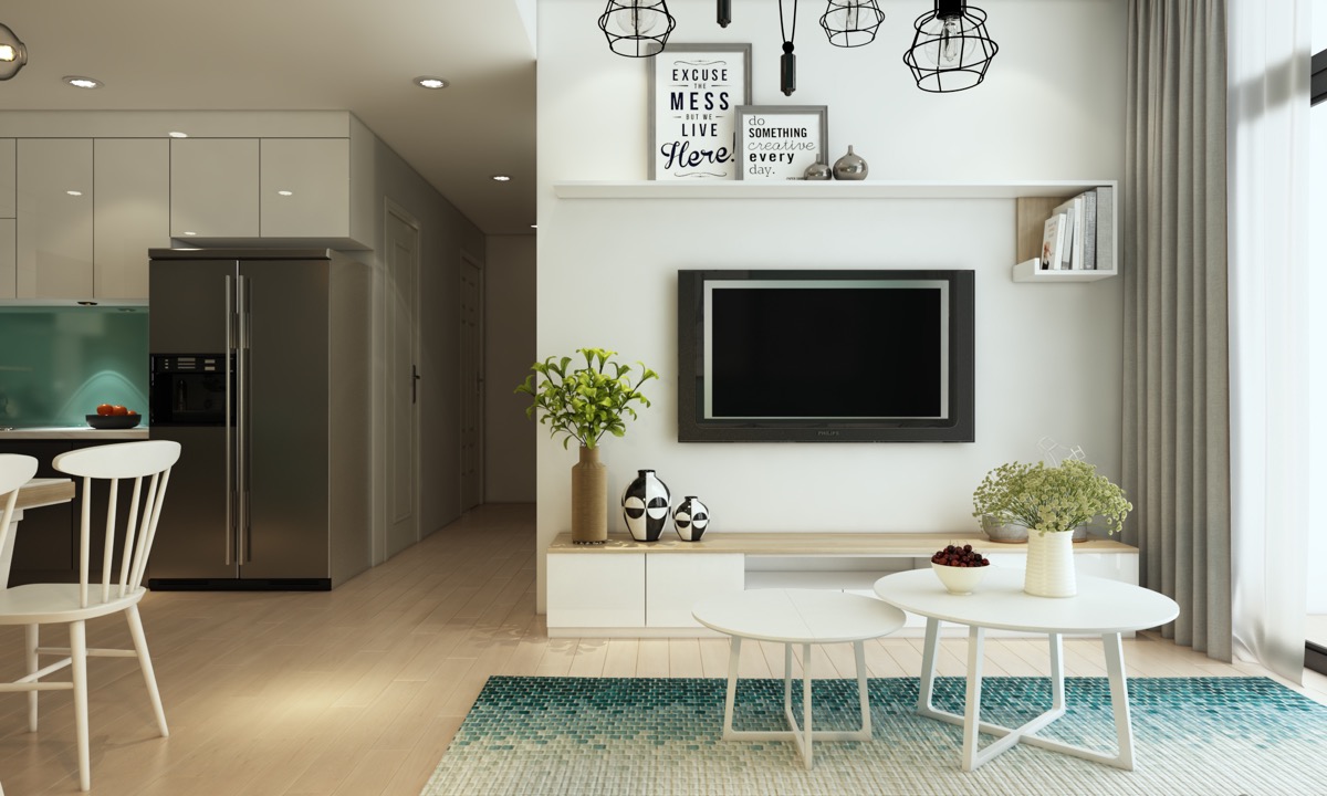
This entertainment wall is made up of a floor standing base unit and a unique wall shelf that displays motivational posters on its surface and a small selection of books within a neat return.
- 8 |
- Visualizer: Vizline Studio
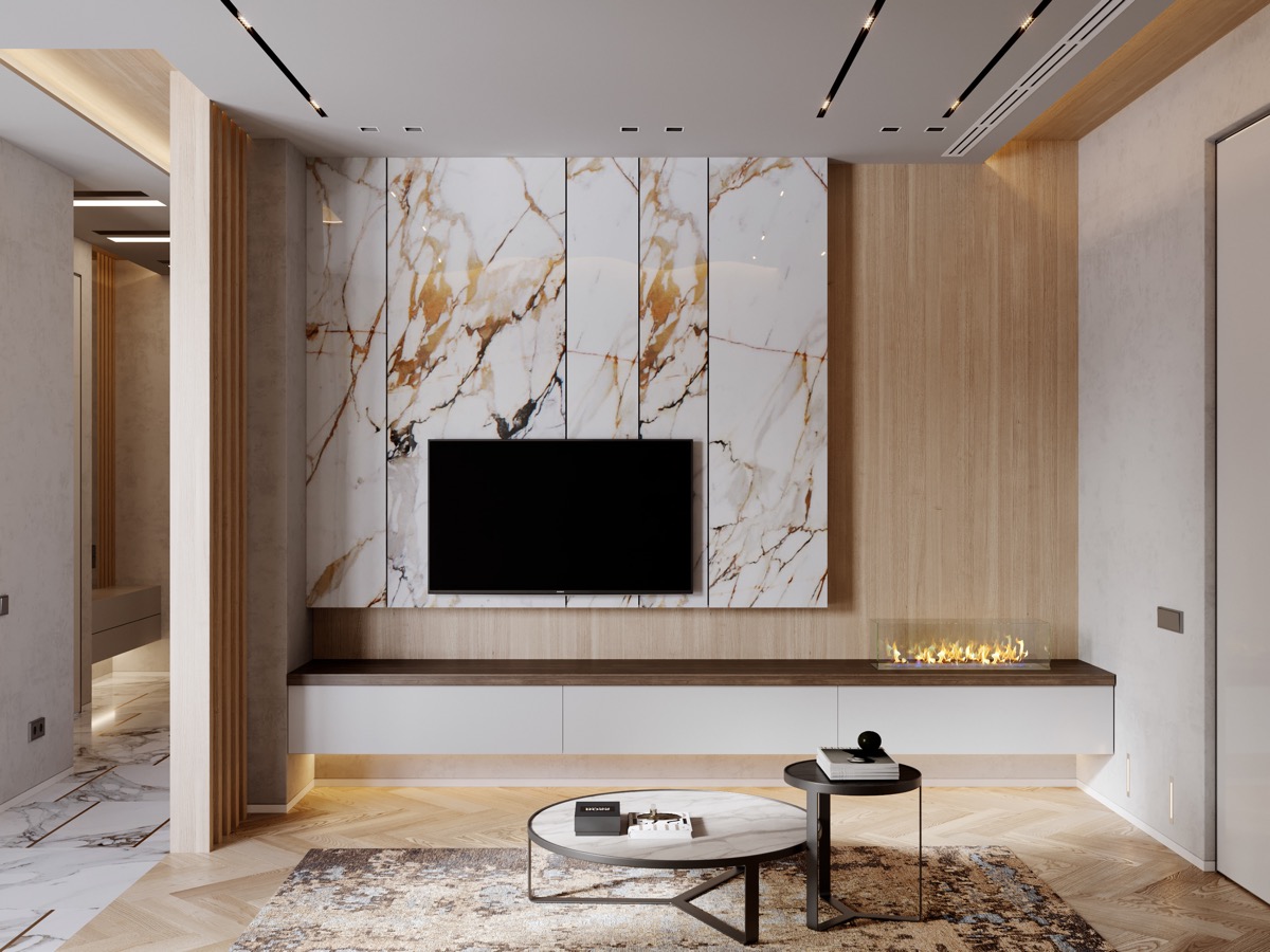
If it’s a luxe look you’re after then how about mounting your TV onto marble effect panels. A side positioned modern fireplace on a low level wall mounted unit adds to the high-end finish, the transparent fireplace screen ensuring visual emphasis remains on the marble. Off topic, but those gorgeous nesting coffee tables help as well!
- 9 |
- Visualizer: Evgeny Garchu
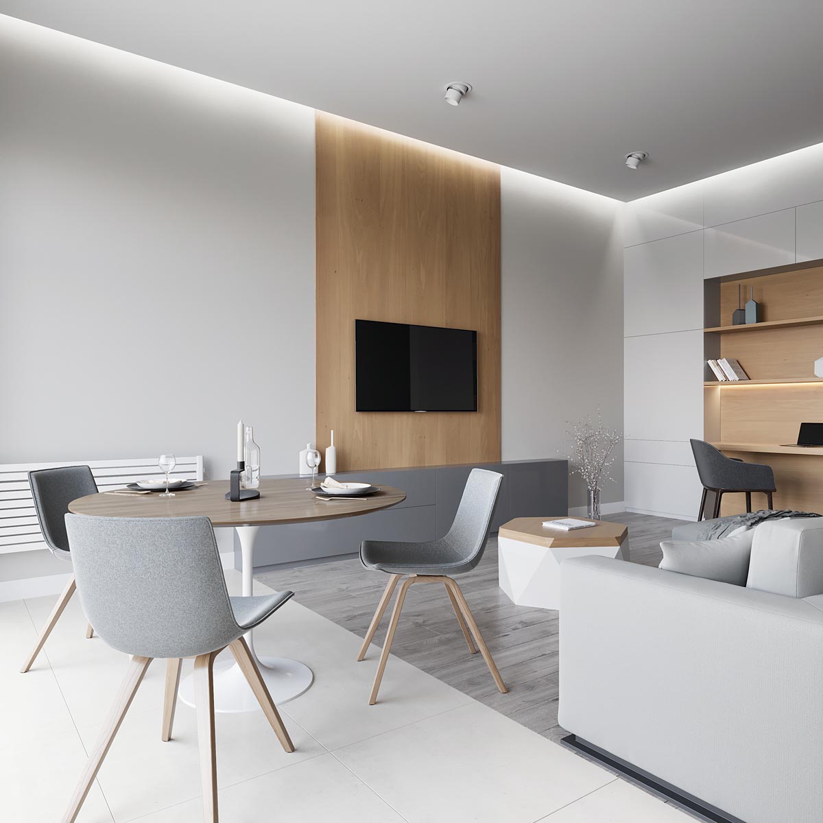
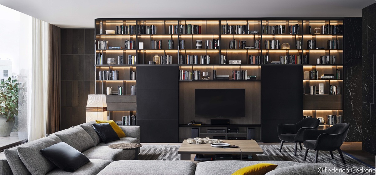
Running a backing panel vertically, all the way from floor to ceiling, creates the impression of a chimney breast when there is none.
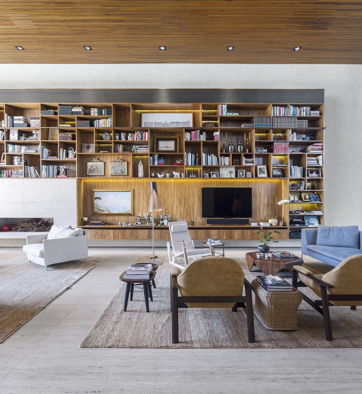
- 10 |
- Visualizer: Lens Decor
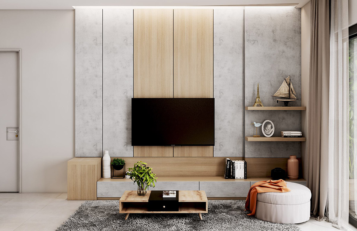
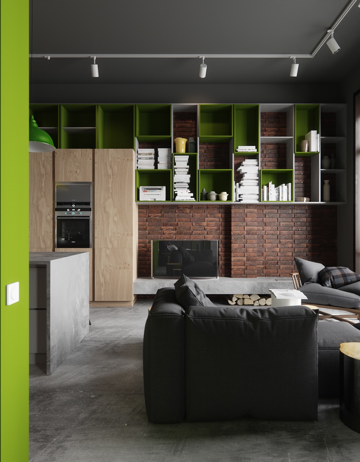
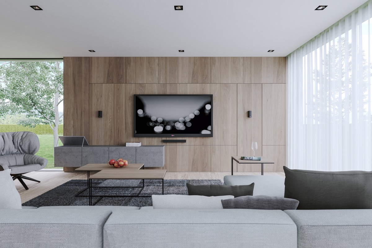
Using two contrasting materials over your wall and storage volumes brings added interest.
- 11 |
- Designer: Talispace
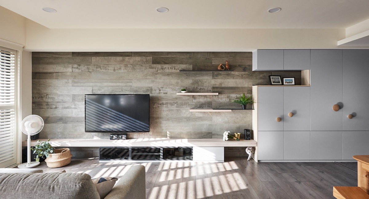
Cat lovers can use the entertainment wall as an opportunity to incorporate cat ladders and feline hideaways. This cleverly constructed wall disguises a cat ladder as a set of casually offset shelves and a cabinet display nook. There is also a cat flap leading into a compartment within an adjacent cupboard.
- 12 |
- Designer: The November Design
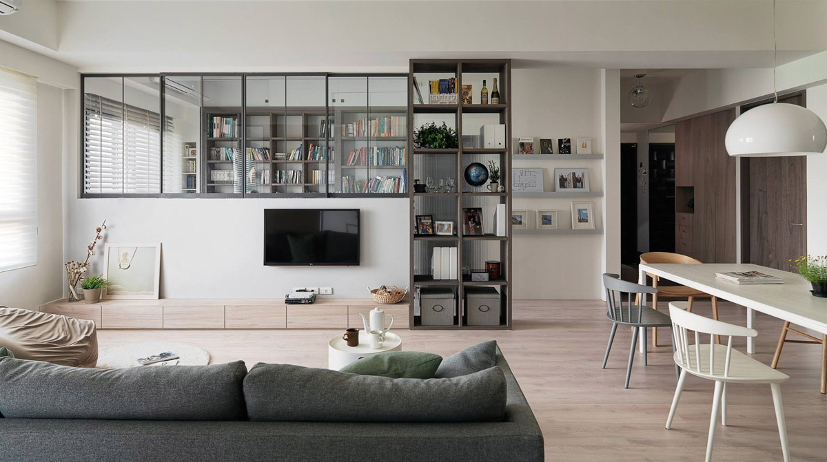
No wall on which to hang your TV? No problem. Consider installing a half height room divide to hold your TV set. The home pictured here topped off the room divider with some internal windows to allow natural light to flow between two spaces.
- 13 |
- Visualizer: DA Visual
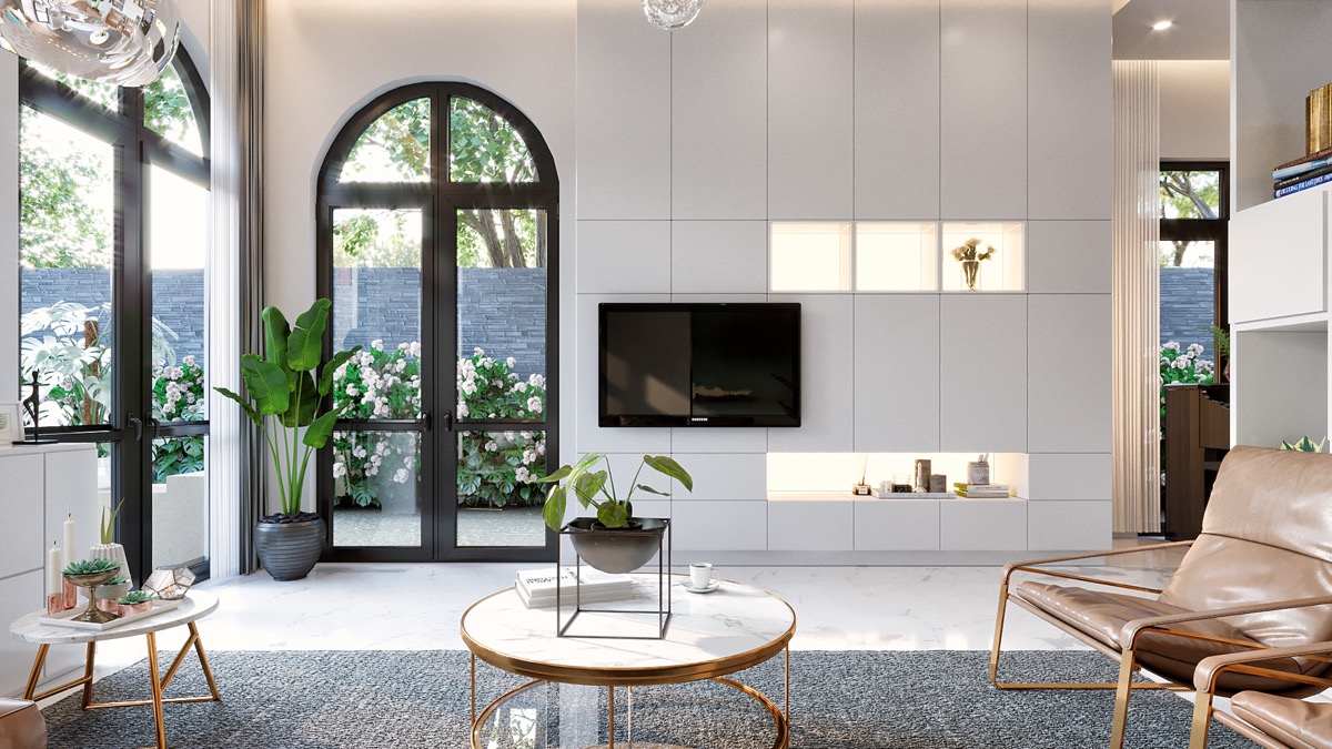
You almost don’t notice the TV in this home beyond the plant stands. Dark window frames balance out the black TV set, and backlit display nooks draw the eye away.
- 14 |
- Visualizer: Alina Prokopenko
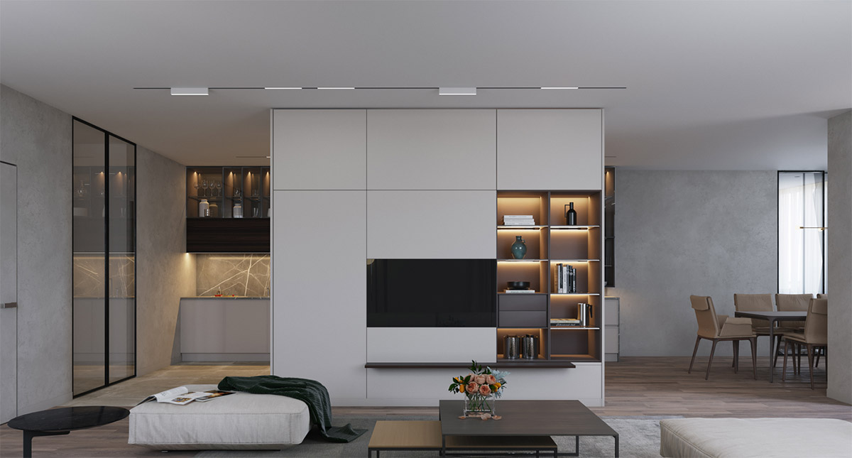
A centrally constructed storage unit provides ideal placement for the television in this home.
- 15 |
- Visualizer: Buro
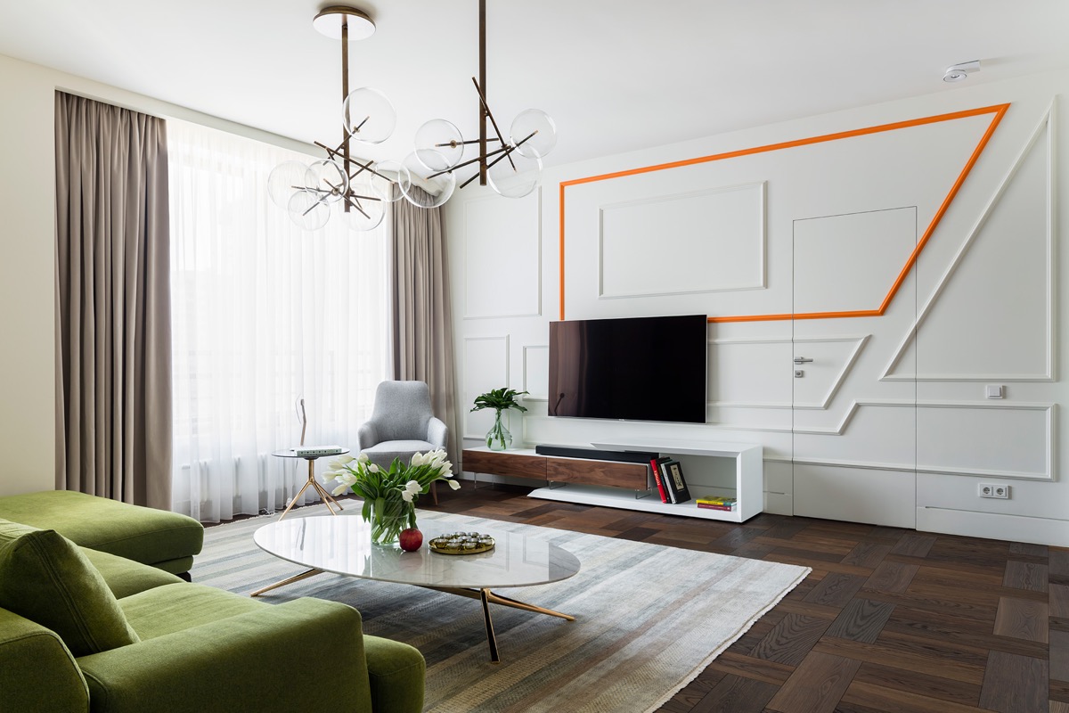
How’s this for a modern take on wainscoting? Asymmetric geometric panels make a technological pattern over this TV feature wall, with one frame picked out in fluorescent orange.
- 16 |
- Visualizer: Mateusz Mielcarek
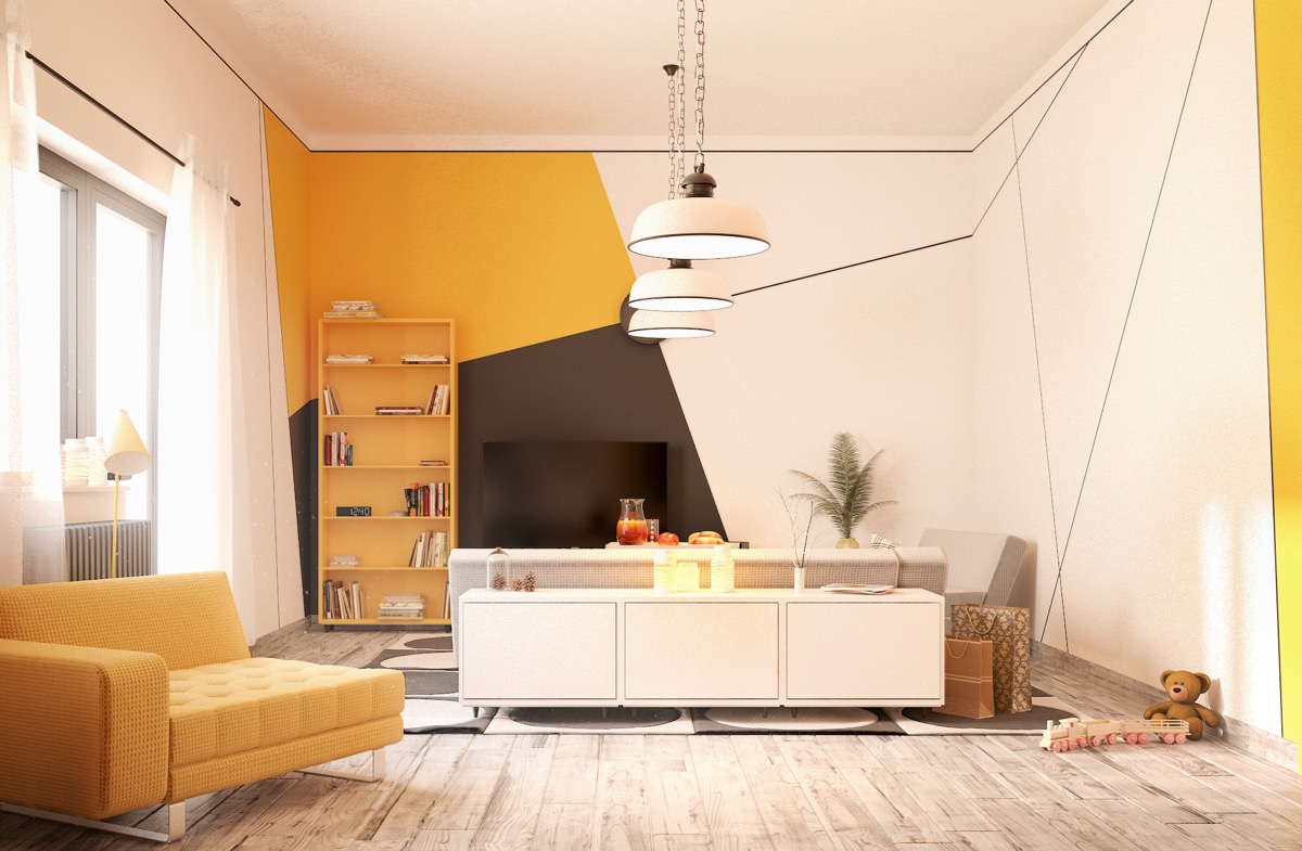
The geometric pattern over this yellow accent living room has been marked out with tape then painted in. The TV is almost invisible against one solid black section.
- 17 |
- Designer: SMLXL
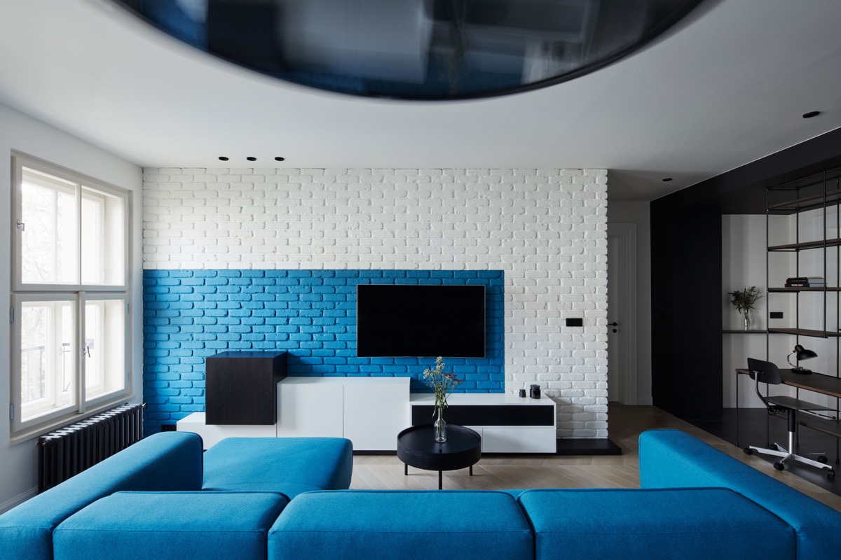
A sectioned of exposed brickwork has been painted to contrast behind the TV in this blue living room.
- 18 |
- Visualizer: Plasterlina
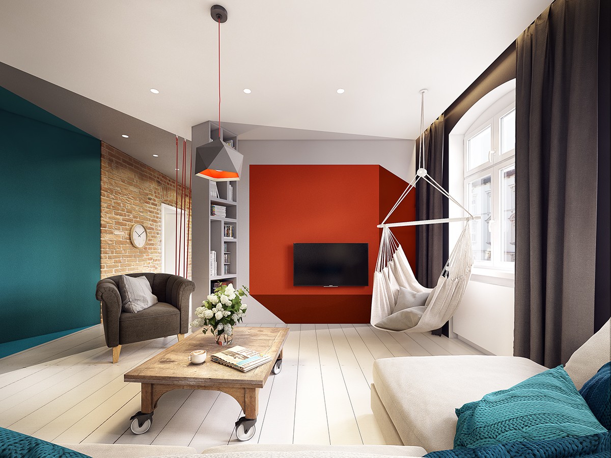
Like optical illusions? Check out how this red paintwork has been applied to appear as a 3D box behind the TV, and the way pale grey sections of paint across the ceiling and floor create a nook with the adjoining bookcase.
- 19 |
- Visualizer: Alina Puzhak
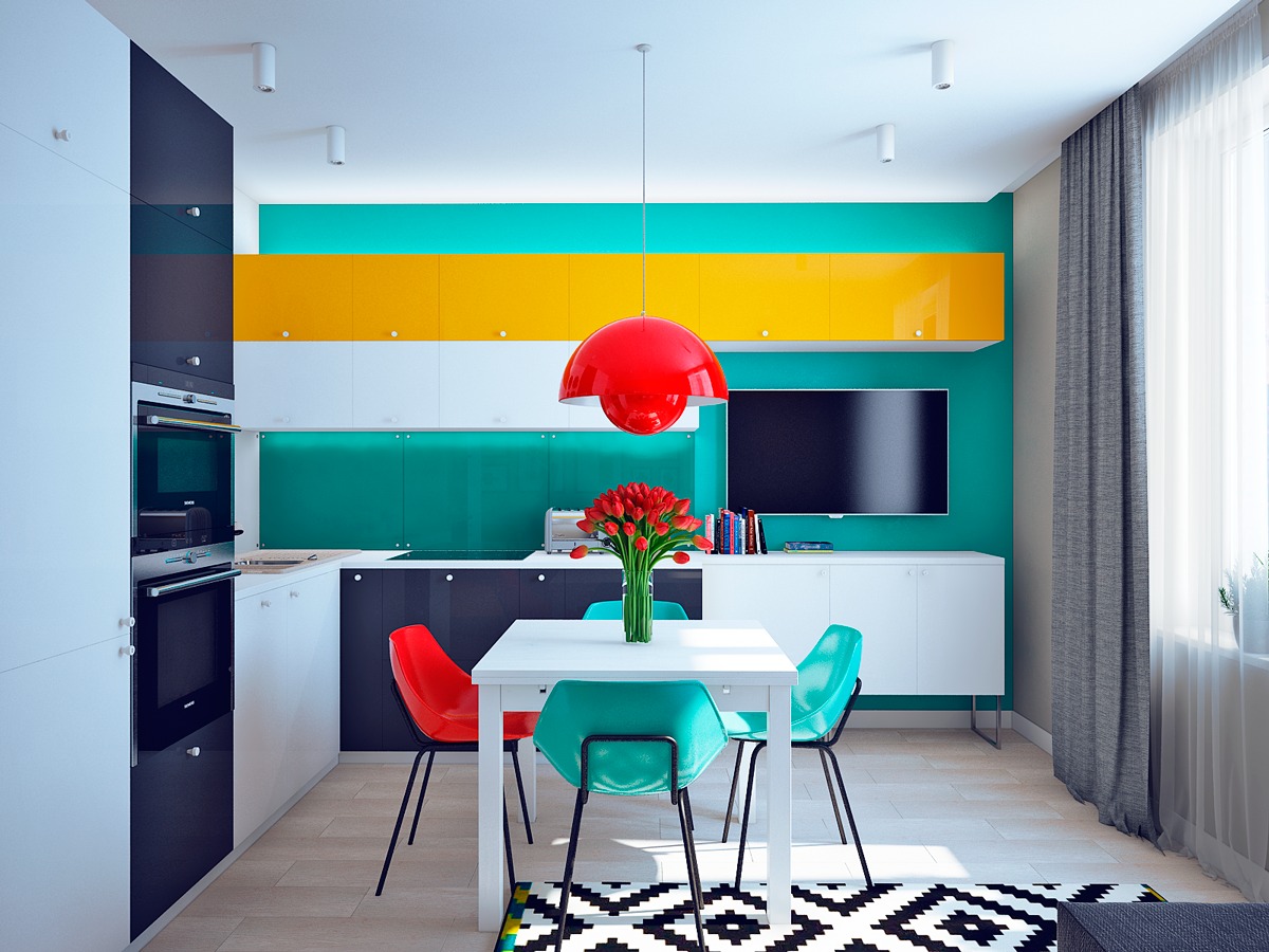
TVs in the kitchen don’t have to be plonked at the end of a countertop either. This one nestles nicely where a run of wall cupboards have been brought up short. The bright yellow ones above pull the kitchen and the television area together.
- 20 |
- Visualizer: Archivizer
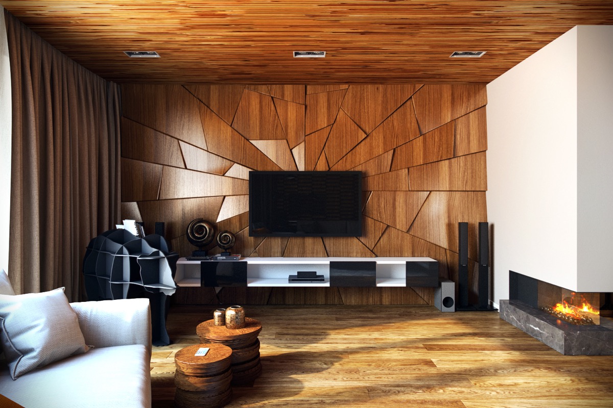
Wood finish accent walls don’t have to be flat. This amazing wooden wall has been designed to mimic shattered glass, with each section of wood cut into a shard. The wooden ‘shards’ were then mounted not quite flush, so that each piece would reflect the light at a slightly different angle to achieve the desired effect.
- 21 |
- Visualizer: BIM Group
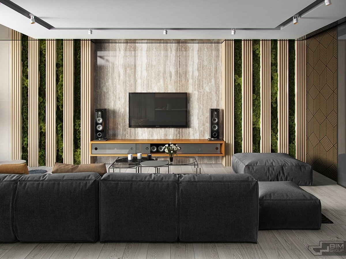
Wood slat walls are another great way to give added texture to a woodtone wall. This one also incorporates sections of ‘living wall’, with plants situated right between the slats.
- 22 |
- Visualizer: Shady Salah
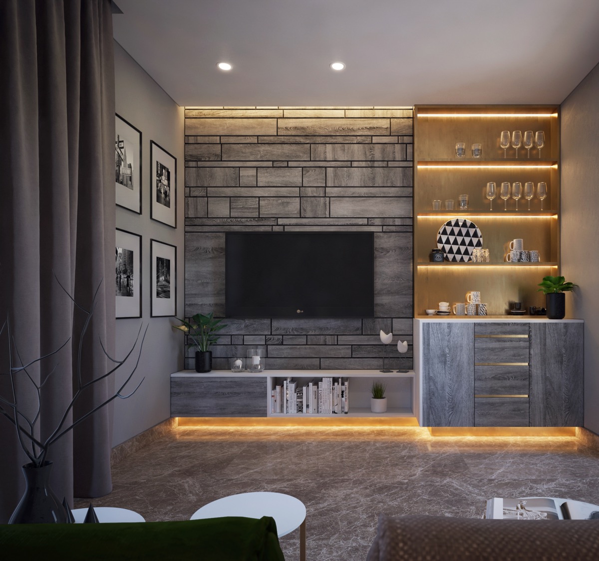
Grey toned wood has been spliced into a tile-like design here. The same wood tone is used for the door of a base console and a side unit that displays decorative crockery and wine glasses.
- 23 |
- Visualizer: Phase 6 Studio
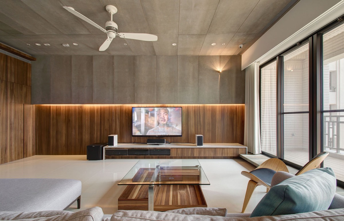
A concrete wall makes a dramatic partnership with wood tone.
- 24 |
- Visualizer: Zoreslava Nartova
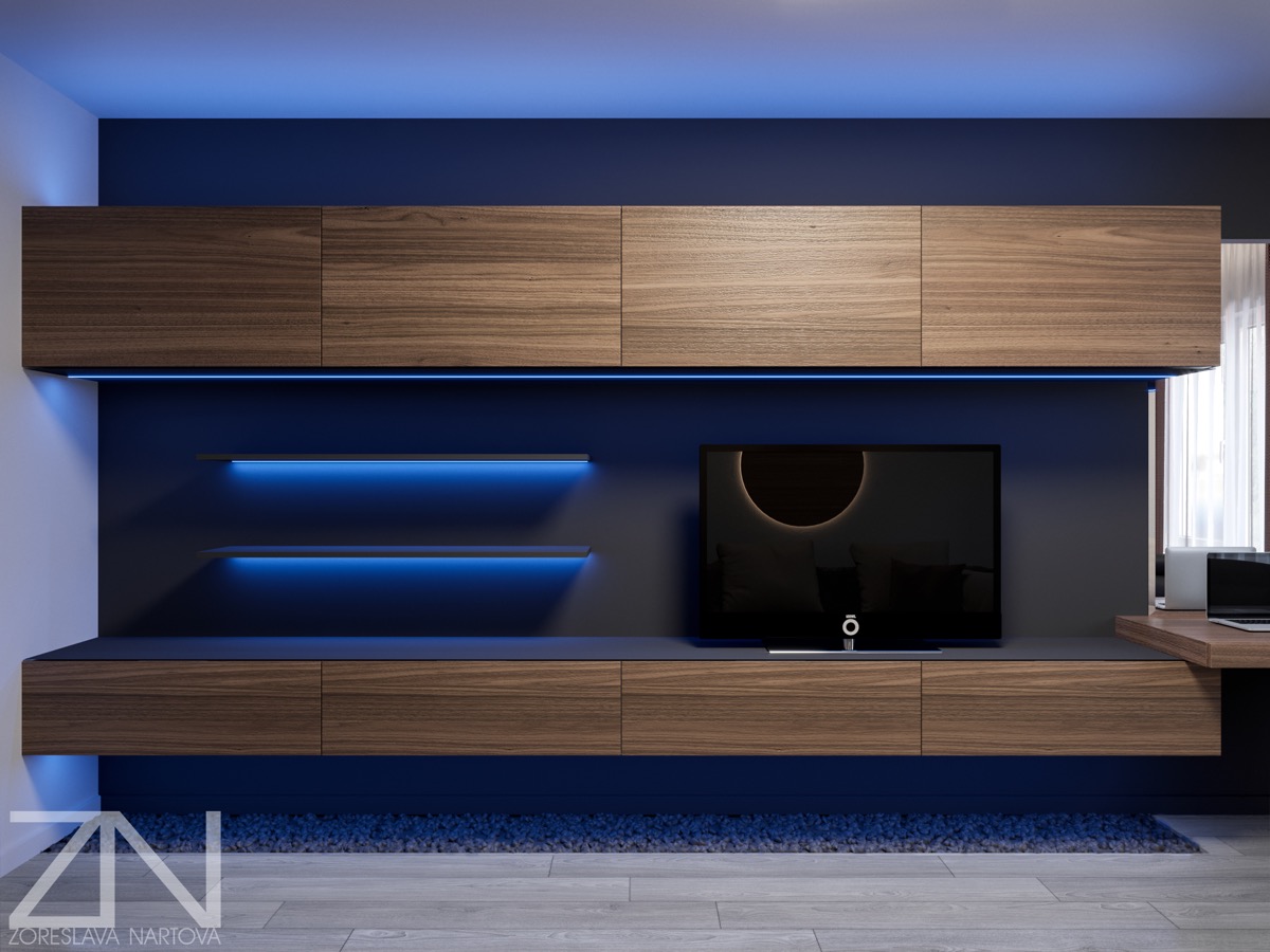
Fans of the Tron movie should appreciate this blue lit technologically inspired feature wall. With colour changing LED lighting this setup could take on many looks. You can get wireless smartphone controlled led lights here.
- 25 |
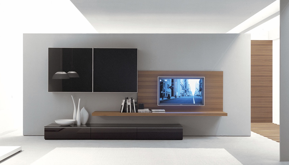
The undulating line of these media units presents a place to put books and a dramatic display of decorative vases.
- 26 |
- Visualizer: Alexey Gulesha
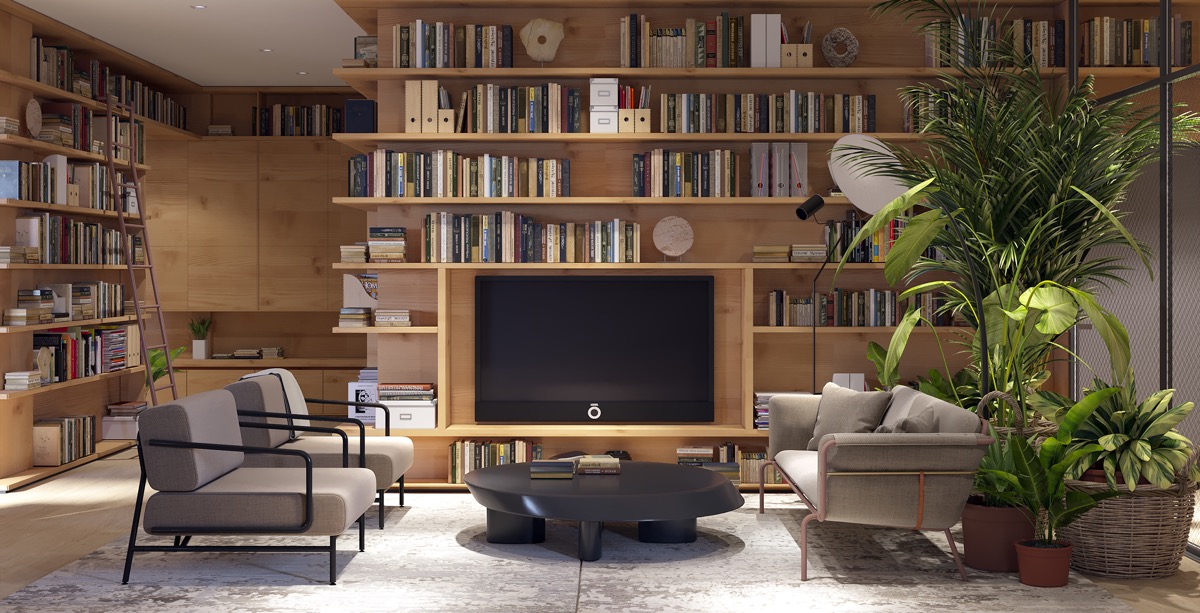
This book lover’s living room sacrifices a book nook for the TV.
- 27 |
- Visualizer: Federico Cedrone
Even though the television takes the centre spot in this living room, the books still take all the spotlight.
- 28 |
- Designer: StudioMK27
A painting is exhibited at one side of this nook to balance out the TV.
- 29 |
- Visualizer: Ruslan Tcacenco
Lime green bookshelves stand out against exposed brickwork over this TV wall. The television is set on a concrete shelf, with wooden logs stowed beneath.
- 30 |
- Visualizer: Zan Studio
Coffee tables and side tables have been matched with the tone of this TV wall panelling.
- 31 |
- Visualizer: Timur Gritsan
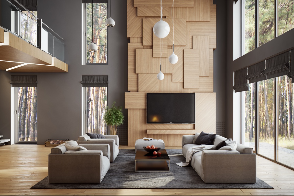
This TV has been mounted to a towering chimney breast where large wooden slabs overlap one another, appearing like a huge work of art.
- 32 |
- Visualizer: Vuong Hai Duong
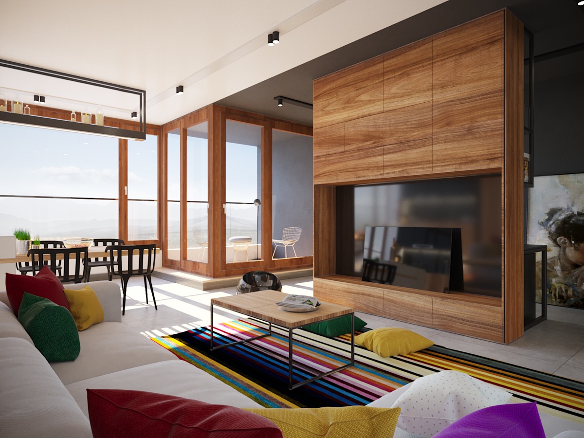
A reflective black backdrop camouflages glossy TV screen. The colourful stripe rug and scatter cushions on the sofa also work to draw the eye away from the powered down set and into the room.
- 33 |
- Visualizer: Sitnik Vladimir
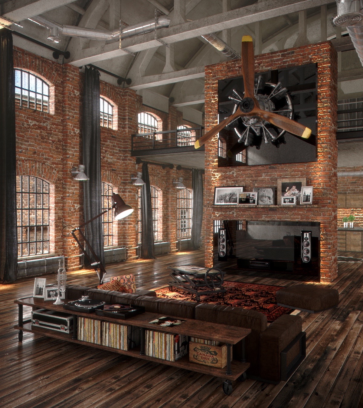
How about this giant propellor to distract the eye from a blank TV set! This brick wall living room has some amazing features but the glossy TV setup with integrated speaker surround looks pretty awesome too.
- 34 |
- Visualizer: Mihail Scherbak & Timothy Kalakutsky
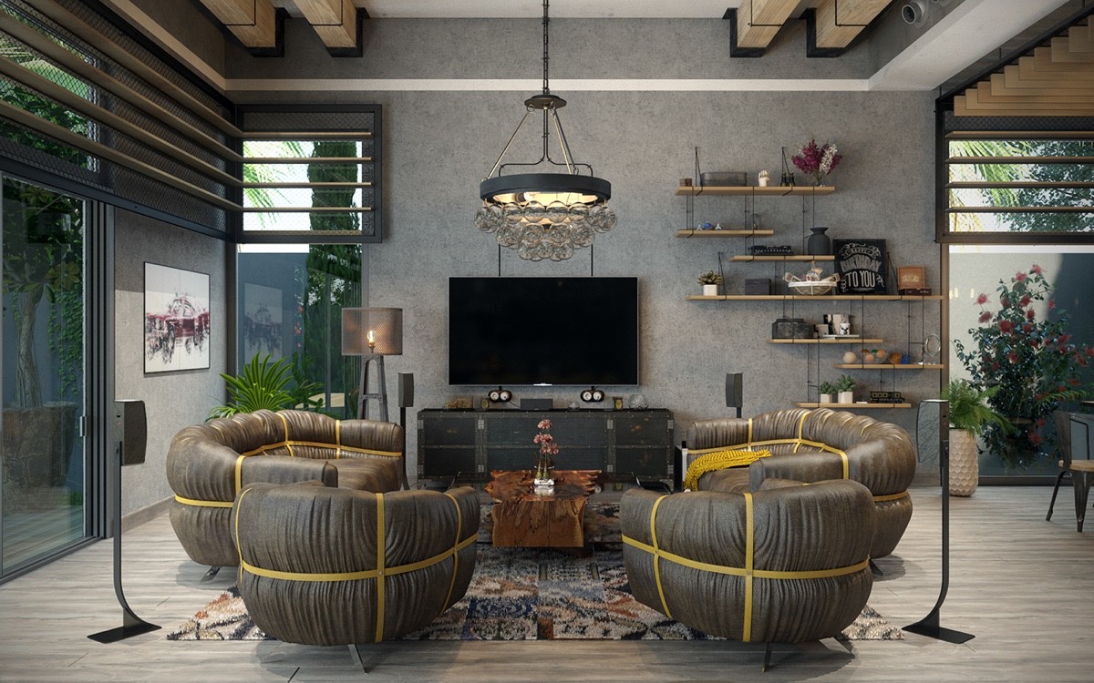
A distressed chest with metal borders and rivets works well in an industrial style living room.
- 35 |
- Visualizer: Mateusz Limanówka
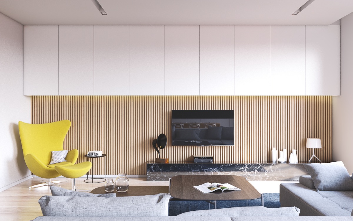
This offset TV console is balanced out by the presence of a bright modern accent chair.
- 36 |
- Visualizer: Mateusz Limanówka & Spacja Studio
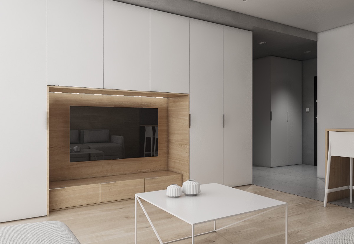
If your home is short on storage, an entertainment wall can be an opportune place to incorporate extra units for possessions other than media consoles and accessories.
- 37 |
- Visualizer: Lugerin Igor
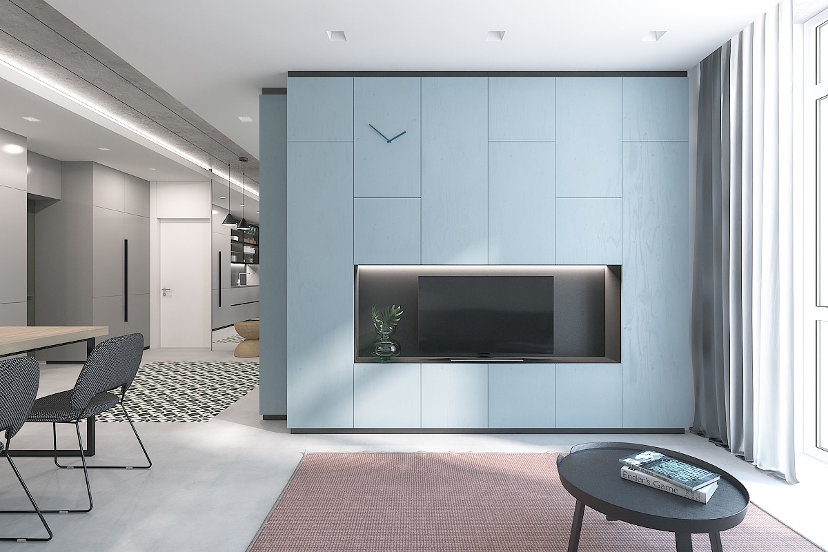
Wall clocks have long held court over mantelpieces, and they look just as good on an entertainment wall.
- 38 |
- Visualizer: Evan Popilnukha
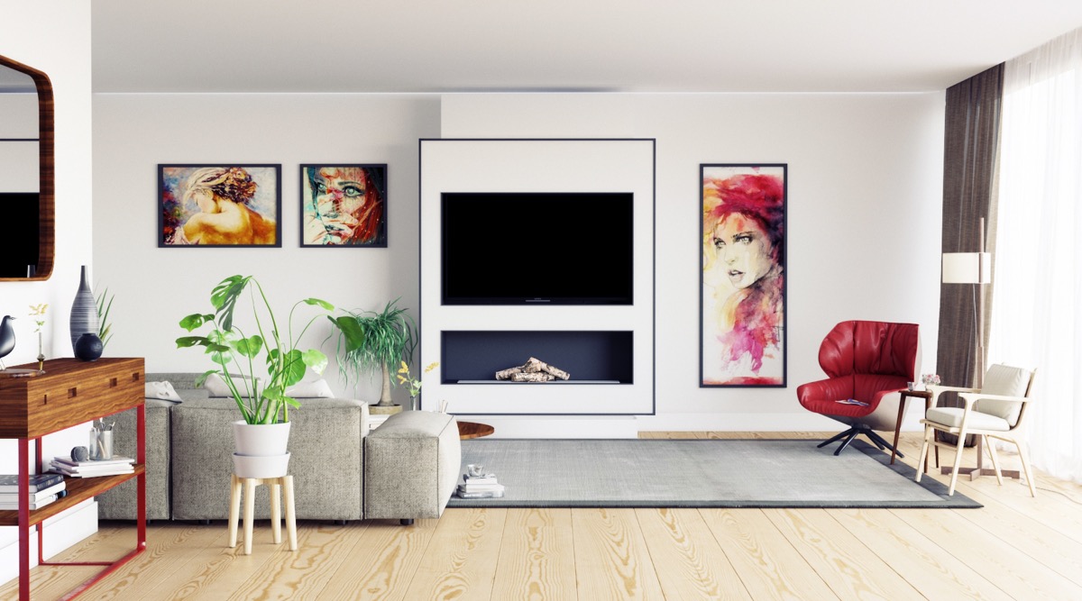
The black frame around this TV panel makes it look like part of the art gallery. If you like this look then check out these living rooms with large wall art.
- 39 |
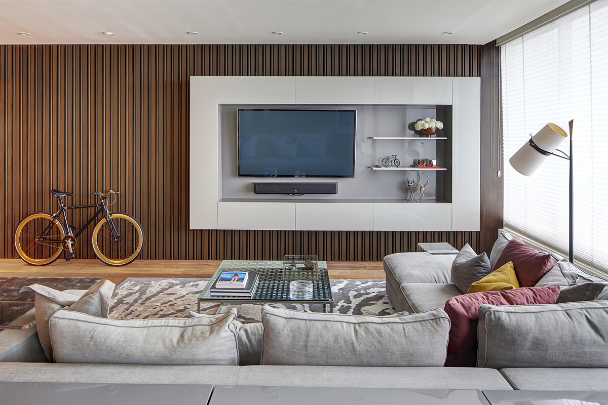
- Architect: Pozas Arquitectos
Units create a chunky frame around this wall mounted television and speaker unit. Display shelves have been set inside the frame for extra visual effect.
- 40 |
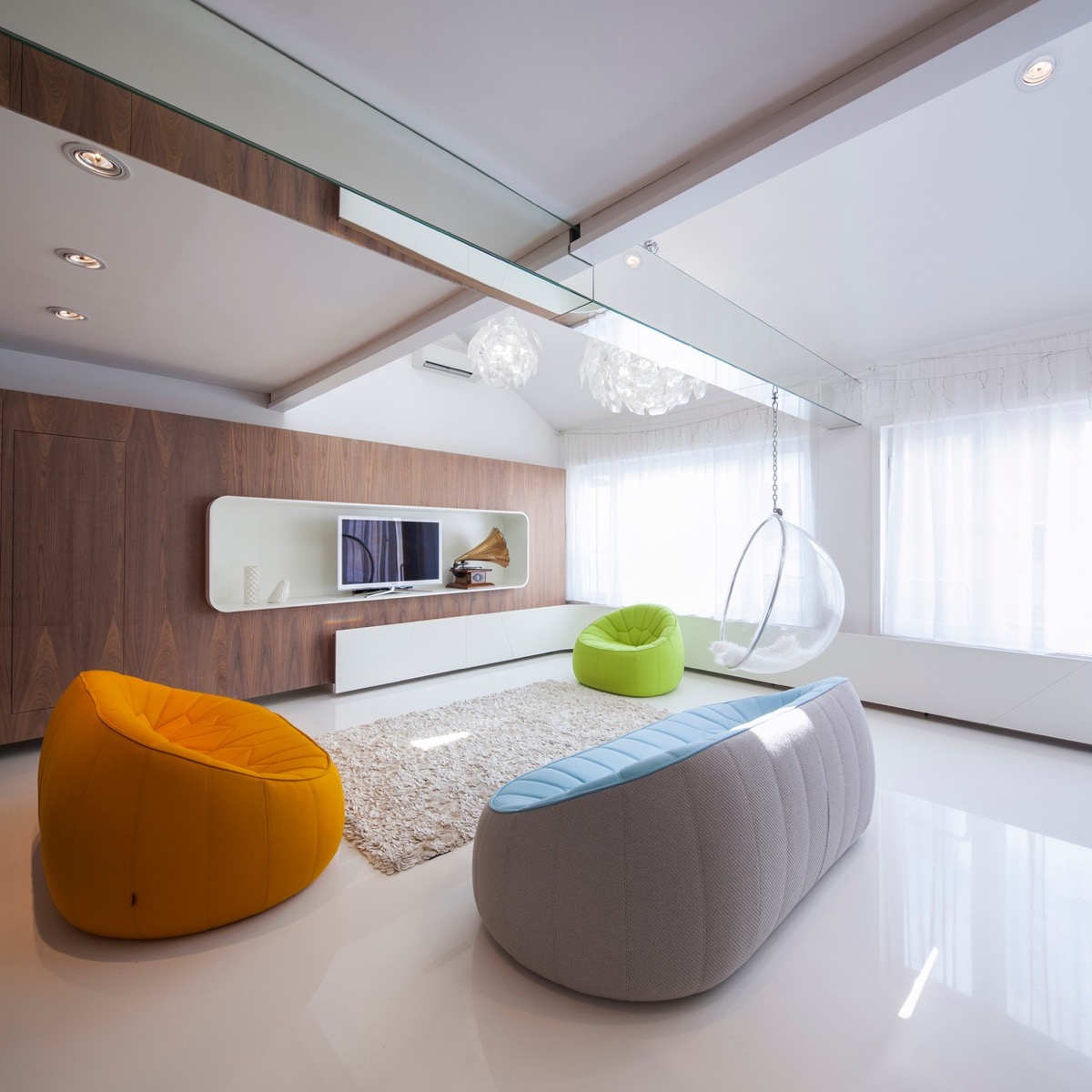
- Designer: Womorrow
This box shelf provides a place to sit a flat screen TV on its stand, along with a few more decorative items.
- 41 |
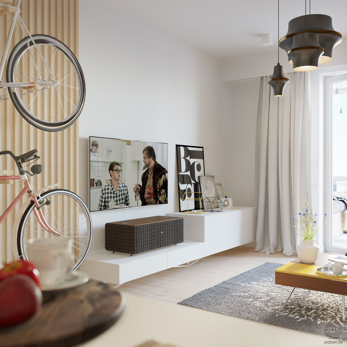
- Visualizer: Zrobym
Split level console units present the opportunity to display large artwork or ornaments without the length of the surface appearing overly cluttered, and without large items or speaker units obstructing the television screen.
- 42 |
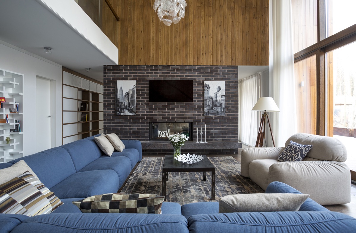
- Visualizer: Denis Davydov & Aleksandr Zhidkov
Sometimes modern fireplaces are still situated centrally, beneath a television set, but be sure to mount your TV high enough so that it doesn’t incur heat damage.
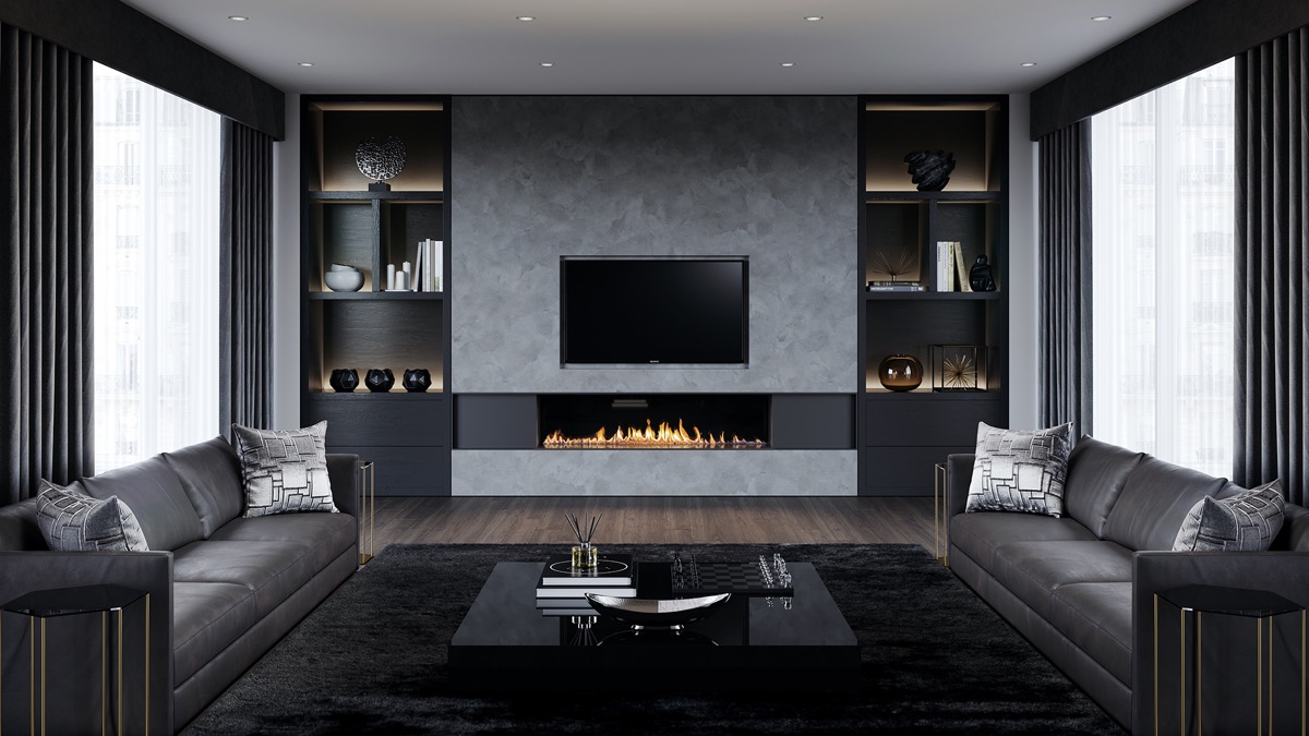
- 43 |
- Visualizer: Eduard Caliman
There’s no denying how effective a contemporary letterbox fireplace looks beneath a flat screen TV, but always check the manufacturers guidelines.
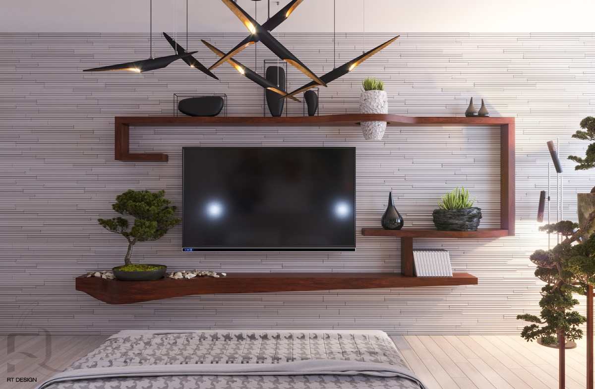
- 44 |
- Visualizer: Tatyana Ryltsova
These unique planters make zen addition to this unique shelving unit, with one of them suspended right through the top surface.
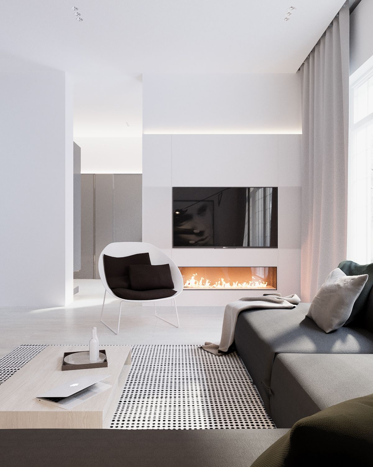
- 45 |
- Visualizer: Yevhen Zahorodnii & Sivak Trigubchak
Alignment and simplicity reigns in this white living room.
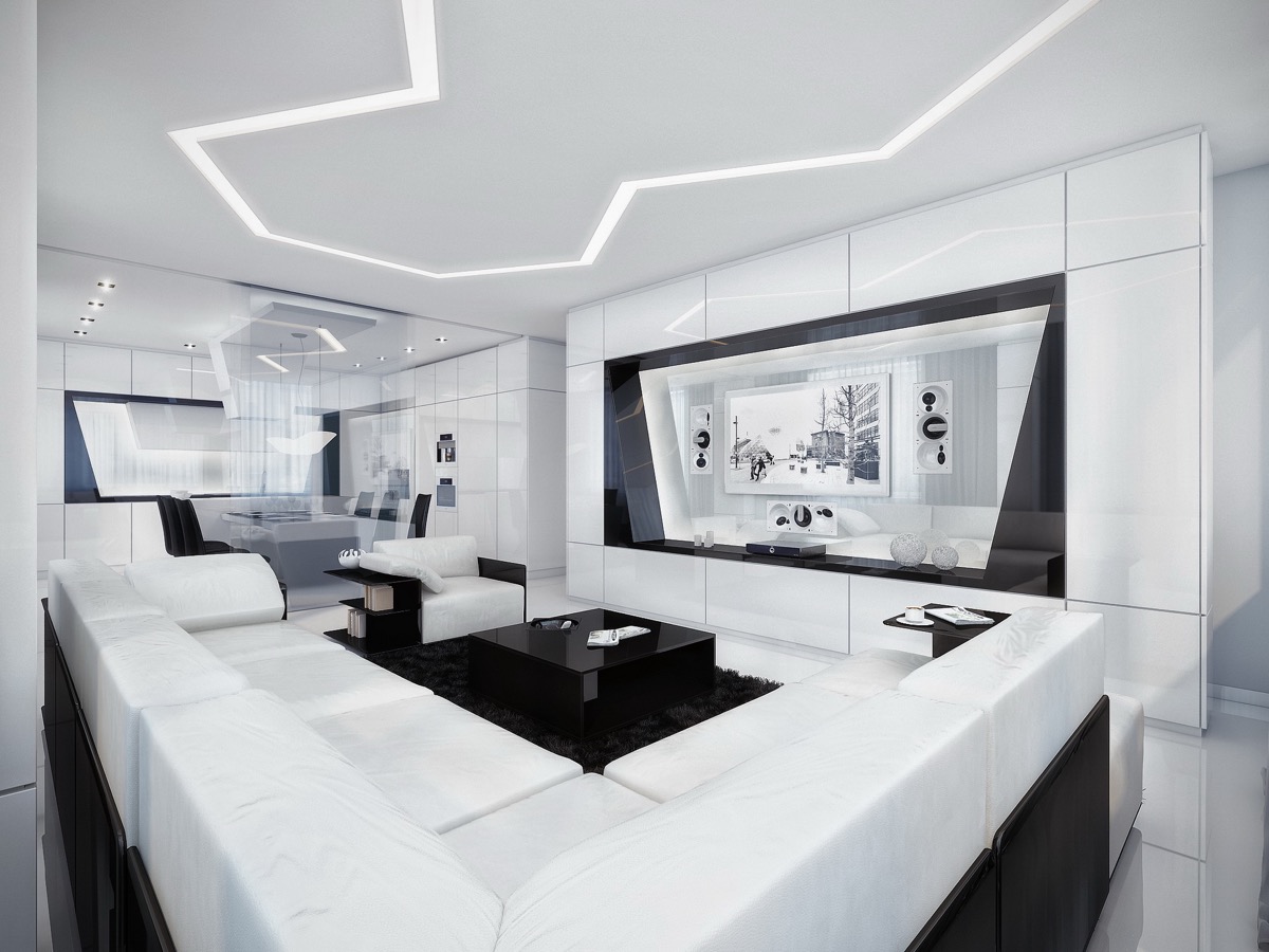
- 46 |
- Designer: Geometrix
This highly futuristic living room has the TV mounted on a transparent dividing wall.
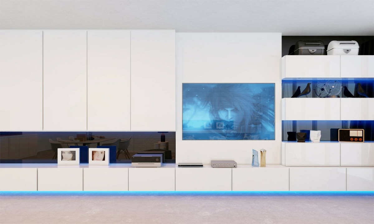
- 47 |
- Visualizer: Blalank Studio
Blue lighting gives a crisp edge to this black and white storage wall that gives pause for a TV.
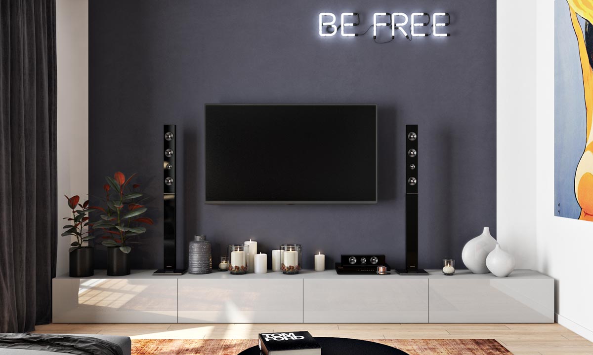
- 48 |
- Visualizer: Julia Sultanova
A minimalist unit is given a new lease of life with a menagerie of decorative candles and scattered tea light holders between the soundsticks.
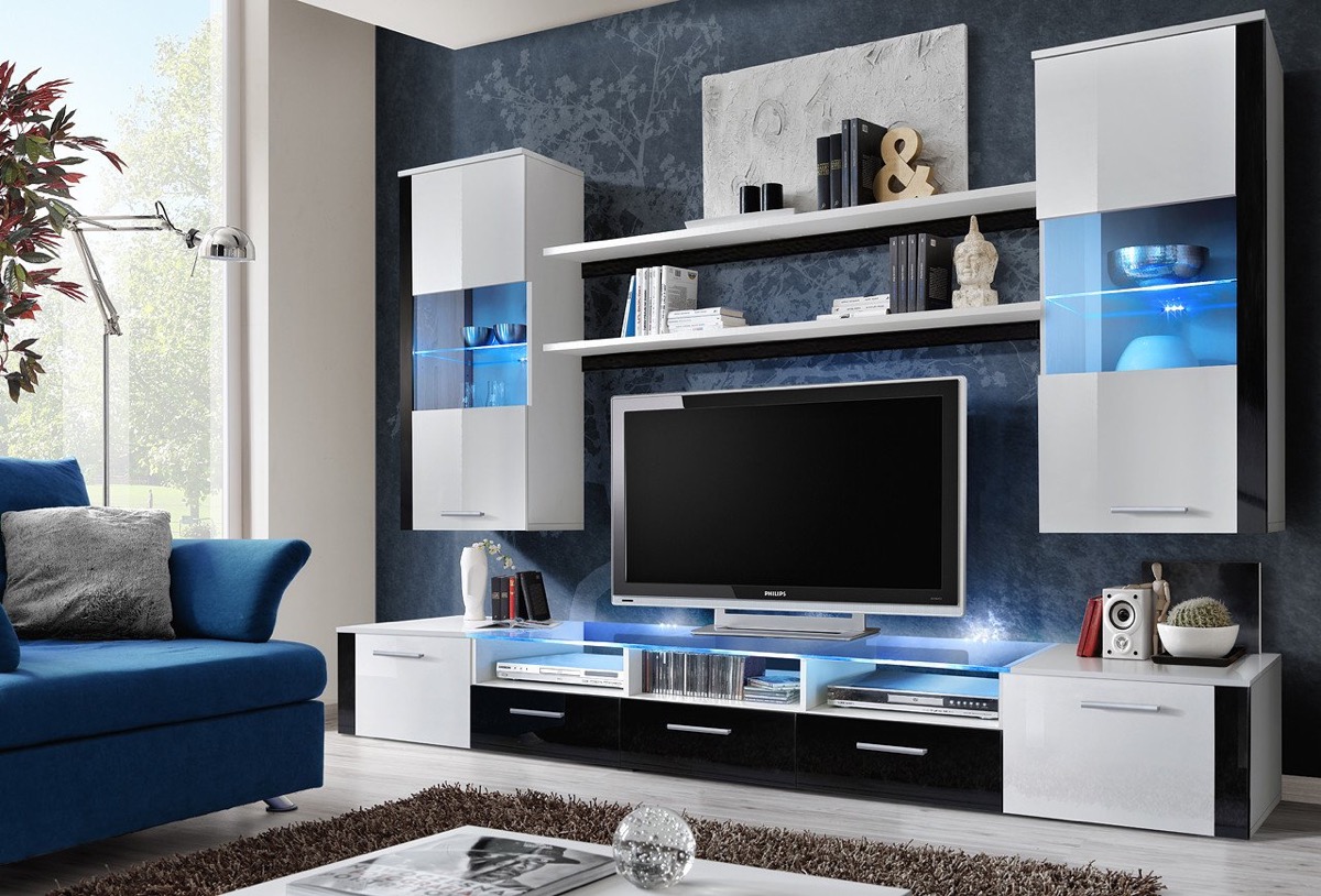
- 49
When creating a TV feature wall, it’s worth investing in beautiful speakers.
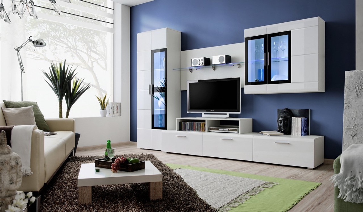
- 50
These neat speakers take pride of place on a glass shelf over the TV.
